


What online methodologies work best in India? How do you get the most out of respondents through digital methodologies in China? Experts across our global boutique share best practice tips and techniques for conducting online market research in Asia.

We work with the world’s leading brands, harnessing research to unlock new ideas, develop future strategies and power business growth.
We bring businesses closer to their customers and help them navigate the broader market, so they can future proof their strategy.
We partner with brands to develop winning products, from concept development right through to pricing research.
We help brands create comms that cut through by understanding the messages which truly resonate with your target audience.
We’re a trusted fieldwork partner to top-tier organisations, providing them with the data they need to drive decision-making.
Our work doesn’t stop at the debrief. We go further, workshopping findings and creating standout creative outputs to raise the impact of research and turn insight into action.

ESOMAR Best Congress Paper
Winner
— ESOMAR, 2023

Market Research Supplier of the Year
Winner
— Marketing Research & Insight Excellence Awards – 2019

Market Research Agency of the Year
Winner – Gold
— Agency of the Year Awards, 2021

Market Research Agency of the Year
Finalist
— Agency of the Year Awards, 2020
Innovation of the Year
Finalist
— The AURAs, 2021

MRS Young Researcher of the Year
Finalist
— MRS, 2023

Consultant of the Year
Winner – Gold
— Agency of the Year Awards, 2021

Consultant of the Year
Winner
— Agency of the Year Awards, 2020

Market Research Agency of the Year
Winner
— Agency of the Year Awards, 2019

Global Agency of the Year
Highly Commended
— Market Research Society Awards, 2019

Best Data Collection (telephone)
Finalist
— Market Research Society's Operations Awards, 2019

Best Training and Development
Highly Commended
— Market Research Society's Operations Awards, 2019
Best Data Collection (face-to-face)
Finalist
— Market Research Society's Operations Awards – 2019
A mixed methodology approach helped Wall Street Journal understand how to position the brand for success in a rapidly changing world.

We ran an industry-leading pilot to test the role of augmented reality in research and its applications to pack testing.

/WL_1200px-Samsung_wordmark.svg-144x22.png?width=144&height=50&name=WL_1200px-Samsung_wordmark.svg-144x22.png)
A comprehensive piece of research to validate Samsung’s CSR efforts in 9 markets, thereby confirming the importance of such initiatives and their positive impact on brand perceptions.

/WL_Bloomberg_Media_stack_blk-144x45.png?width=144&height=50&name=WL_Bloomberg_Media_stack_blk-144x45.png)
Neuroscience helped Bloomberg show that its advertising platform is a cut above the rest and delivers better outcomes for advertisers.
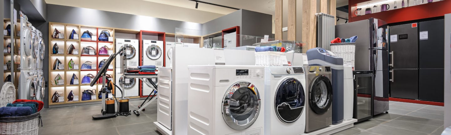
Interviews with consumers have helped Panasonic determine NPS scores and benchmark themselves against the competition.

/WL_Mitsubishi-110x120.png?width=144&height=50&name=WL_Mitsubishi-110x120.png)
A quantitative survey helped Mitsubishi Motors to understand how its vehicles were being used in the real world, informing how best to position communications about the role and value of PHEVs.

/WL_unilever3-132x60.png?width=144&height=50&name=WL_unilever3-132x60.png)
We took part in a first of its kind pilot to test the technology and assess what it could bring to market research.
/WL_treatwell-216x40.png?width=144&height=50&name=WL_treatwell-216x40.png)
An extensive programme of research has helped Treatwell deepen its valued B2B relationships and shape its strategy around their needs.


We knew from the start that the inaugural GoBear Financial Health Index was going to need the right research partner to realise our vision. This team needed a curious mind, sharp analysis, as well as the willingness to roll up their sleeves and get hands on with us. Kadence International has proven to be that partner and the study’s success has exceeded my expectations. I am excited to see future iterations of the study with them by our side.
Vice President – Marketing
GoBear
Thanks to the support of Kadence team, we were able to meet all the goals we had set for ourselves with the Consumer Passport Programme, inculcating a culture of customer centricity – as a passionate brand, we believe that the customer comes first; without the customer no business can be successful – and seeing the world through the customer’s point of view to understand the realities of market.
/WL_1200px-Havells_Logo.svg-364x240.png?width=364&height=240&name=WL_1200px-Havells_Logo.svg-364x240.png)
Havells
I have leveraged Kadence’s design and curation services extensively over the last year and continue to be wowed by their speed, agility, and quality of output. The team helped me turn multiple key presentations and infographics last year into WOW content, helping create compelling stories that were memorable and effective. Probably more than anything, I value their partnership and willingness to help, not just “sell” which is rare in today’s world!
Senior Insights Leader
Mars
The team go the extra mile to make sure all the details are covered and to ensure the successful completion of our projects. Kadence always put the client’s priorities and perspectives ahead of anything else and create an experience that reflects our marketing needs / goals.
Corporate Communications / Public Relation
Brand Management Department
Panasonic – Singapore
Working with Kadence UK has been a truly great experience. Their research consistently delivers invaluable insights that drive informed decision-making. From the start, trust has been at the centre of our collaboration. Every interaction feels like a true partnership, and I consider them an extended part of our team when working together on different projects.
Anastasia Mellier
Global Consumer Insights Manager
Kadence team is more like a partner to us. We have run a number of projects together and … the pro-activeness, out of the box thinking and delivering in spite of tight deadlines are some of the key reasons we always reach out to them.
/WL_vital-strategies-logo-294x91.png?width=294&height=91&name=WL_vital-strategies-logo-294x91.png)
Vital Strategies
Kadence helped us not only conduct a thorough and insightful piece of research, its interpretation of the data provided many useful and unexpected good-news stories that we were able to use in our communications and interactions with government bodies.
General Manager PR -Internal Communications & Government Affairs
Mitsubishi
Kadence has produced an exceptional body of work which plays a crucial part in planning marketing strategies and understanding the opportunities for our business as we continue to grow. We couldn’t ask for a better partner; they provided true expertise, valuable insights and commitment to quality across each project.
Performance Marketing & Analytics Director
Treatwell
We have been working with Kadence for more than 5 years on various strategic global B2C and B2B projects.
They always deliver a high-quality delivery, with insightful and valuable recommendations that helped us better define our brand strategy towards our customers and professional partners.
We have built a strong collaboration over the years with Kadence teams, and they are fully trusted by the whole organization.
Royal Canin Global Brand Strategy & Insights team
Royal Canin
Kadence were an excellent partner on this project; they took time to really understand our business challenges, and developed a research approach that would tackle the exam question from all directions. The impact of the work is still being felt now, several years later.
Customer Intelligence Director
Wall Street Journal
We have been engaged with Kadence since 2016. Since our first partnership, Kadence has been instrumental in supporting our business efforts and have continuously proven their value in research, insights and analysis that have helped us to gain many wins. Kadence consistently pushes the boundaries and offer inspirations that provide deep business insights and drive business strategies.
Head of Research
Bloomberg
At Panasonic, we’ve always believed in collaborative work. Here, Kadence has been instrumental in helping us understand our status quo, identify the key drivers of NPS and strategic improvement areas across our refrigerator, air conditioners and washing machine categories. Team Panasonic is grateful for the sincere efforts put in, this in turn, will help us serve our consumers better.
/WL_Panasonic-Logo.svg-392x69.png?width=392&height=69&name=WL_Panasonic-Logo.svg-392x69.png)
Panasonic – India
Kadence has been a long term partner with Changi Airport Group, providing research and insights to help shape our communication and business strategy. The team offers sound counsel on research projects and can distil complicated information and present it clearly, and succinctly to the audience. Engaging our audience does not stop even when travel is still restricted; this research helps Changi Airport assess our communications efforts in key markets to emerge prepared when travel resumes.
/WL_CAGLogo-180x120.jpg?width=180&height=120&name=WL_CAGLogo-180x120.jpg)
Changi Airport
We’ve been working with Kadence on a couple of strategic projects, which influenced our product roadmap roll-out within the region. Their work has been exceptional in providing me the insights that I need.
Senior Marketing Executive
Arla Foods
I have been working with Kadence for more than 4 years and they have always delivered consistently good outputs. Their ability to understand business goals and translate them to research objectives as well as a high degree of flexibility by collaborating with clients and providing recommendations that are otherwise overlooked differentiate them from other research agencies in the market.
Head of Insights
Discovery
With over 30 years in the business of market research, we have extensive experience and a depth of knowledge across a range of sectors.
We bring this to bear to design the very best approach to meet your objectives.
Kadence helps brands make confident, informed decisions by combining global expertise with strong local insight. As a market research agency, we work with businesses to better understand their customers, test new ideas, refine messaging and explore new opportunities using a mix of qualitative research, data analysis and collaborative workshops.
Our focus is not just on gathering information, but on turning it into clear, practical direction teams can actually use.
/WL_bloomberg-392x72.png?width=392&height=123&name=WL_bloomberg-392x72.png)
/WL_unilever3-132x60.png?width=392&height=123&name=WL_unilever3-132x60.png)
/WL_1200px-Samsung_wordmark.svg-144x22.png?width=392&height=123&name=WL_1200px-Samsung_wordmark.svg-144x22.png)
/WL_Mitsubishi-110x120.png?width=392&height=123&name=WL_Mitsubishi-110x120.png)
/WL_Arla-358x240.png?width=392&height=123&name=WL_Arla-358x240.png)


