Stephen Few once said, “Numbers have an important story to tell. They rely on you to give them a clear and convincing voice.” This quote captures the essence of data storytelling—transforming raw data into compelling narratives that drive action and influence decisions.

Data storytelling combines data, visuals, and narrative to create a powerful tool that informs, engages, and persuades. As brands gather vast amounts of data, the real challenge lies in converting this data into actionable insights. Effective data storytelling bridges this gap by making complex data understandable and relatable, turning abstract numbers into stories that resonate.

The demand for data storytelling skills has grown significantly. LinkedIn reports that data analysis remains one of the most sought-after skills for recruiters. Despite this, there’s often a disconnect between those who can analyze data and those who can communicate the insights effectively. Many professionals with advanced degrees in economics, mathematics, or statistics excel at data analysis but struggle with the “last mile”—communicating their findings.

With the rise of self-service analytics and business intelligence tools, more people across various business functions are generating insights. This democratization of data has led to an unprecedented number of insights produced. Yet, without the ability to tell a compelling data story, many of these insights fail to drive action.

Data storytelling is not just about creating visually appealing charts and graphs. It’s about weaving a narrative that highlights the significance of the data, provides context, and makes the insights memorable. Stories have always been a powerful way to communicate ideas and influence behavior. In the context of data, storytelling can help transform complex information into an understandable but also compelling and actionable narrative.

The Importance of Data Storytelling

Historical Perspective

Back in 2009, Dr. Hal R. Varian, Google’s Chief Economist, made a prescient statement: “The ability to take data—to be able to understand it, to process it, to extract value from it, to visualize it, to communicate it—that’s going to be a hugely important skill in the next decades.”

Fast forward to today, and Varian’s prediction has proven remarkably accurate. As businesses amass more data than ever, the ability to analyze and effectively communicate this data has become crucial.

Current Trends

The demand for data storytelling skills is on the rise. LinkedIn’s recent Workforce Report highlighted that data analysis skills have consistently ranked among the top sought-after skills by recruiters over the past few years. Data analysis was the only category consistently ranked in the top four across all the countries analyzed. This surge in demand underscores the critical need for professionals who can bridge the gap between data analysis and decision-making.

The role of data storytellers is becoming increasingly vital within organizations. These individuals possess a unique blend of skills that allow them to not only analyze data but also craft narratives that make the insights accessible and actionable. As more organizations recognize the value of data-driven decision-making, the ability to tell compelling data stories is becoming a highly prized skill.

The “Last Mile” Problem

Despite advancements in data analytics, many businesses still struggle with what is often referred to as the “last mile” problem—the gap between data analysis and actionable insights. This gap exists because many data professionals are adept at uncovering insights but lack the skills to communicate these findings effectively. 

Without clear communication, valuable insights can remain hidden, and their potential impact is lost.

For example, a report by McKinsey & Company highlighted that while brands are increasingly investing in data and analytics, many are not realizing the full value of these investments due to a lack of effective communication. The report emphasized the importance of translating data insights into clear, compelling narratives to drive action and change within organizations.

Moreover, as self-service analytics tools become more prevalent, the responsibility for generating insights is expanding beyond traditional data teams. This democratization of data means that more people across various business functions are generating insights. However, without the ability to tell a compelling data story, these insights often fail to drive action.

Components of Data Storytelling

Data

At the heart of any data story lies the data itself. Valuable data is accurate, relevant, and timely. It is the foundation upon which insights are built, and without reliable data, the entire storytelling effort can falter.

Valuable data should be comprehensive enough to provide a complete picture and focused enough to address specific questions or problems. It’s not just about the quantity of data but the quality. High-quality data should be clean, well-organized, and representative of the phenomena it aims to describe. In data storytelling, data serves as the factual backbone, lending credibility and substance to the narrative being crafted.

Visuals

Data visualization is a powerful tool in data storytelling. It transforms raw data into visual formats like charts, graphs, and maps, making complex information more accessible and easier to understand. Visuals help to highlight key trends, patterns, and outliers that might be missed in a table of numbers. 

According to a study by the Wharton School of Business, presentations using visual aids were 67% more persuasive than those that did not. Effective data visualizations clarify the data and engage the audience, making the insights more memorable and impactful. They act as the visual representation of the story, providing a clear and intuitive way for audiences to grasp the significance of the data.

Narrative

The narrative is the element that brings data and visuals together into a coherent and compelling story. A well-crafted narrative provides context, explaining what the data means, why it matters, and how it can be used. It guides the audience through the data, highlighting the key insights and their implications. Storytelling has been fundamental to human communication for thousands of years because it resonates emotionally.

According to neuroscientist Dr. Paul Zak, stories can trigger the release of oxytocin, a hormone associated with empathy and trust. This emotional engagement helps to make the data more relatable and memorable. In data storytelling, the narrative acts as the bridge between the logical and emotional sides of the brain, ensuring that insights are not only understood but also felt and acted upon.

Why Data Storytelling is Essential

Human Connection

Data storytelling is more than just a method for presenting information; it’s a way to forge a human connection. Neuroscientific research has shown that stories stimulate the brain in ways that pure data cannot.

When we hear a story, multiple areas of the brain light up, including those responsible for emotional processing. Dr. Paul Zak’s research on oxytocin reveals that this “trust hormone” is released when we engage with a story, fostering empathy and connection. We tap into this emotional response by weaving data into a narrative, making the information more relatable and impactful. This connection is crucial for influencing decision-making, as it helps audiences understand the data and feel its significance.

Memorability

Stories are inherently more memorable than raw data. A study by Stanford professor Chip Heath demonstrated that 63% of people could remember stories, whereas only 5% could recall individual statistics. This disparity is because stories provide context and meaning, making the information easier to recall. Heath’s research involved participants using an average of 2.5 statistics in their presentations, but only 10% incorporated stories. Despite this, the stories were what audiences remembered. By embedding data within a narrative framework, data storytelling enhances retention, ensuring that key insights stick with the audience long after the presentation is over.

Persuasiveness

The power of stories to persuade is well-documented. In a study comparing two versions of a brochure for the Save the Children charity, one featuring infographics and the other a story about a girl named Rokia from Mali, the story-based version significantly outperformed the infographic version in terms of donations. 

Participants who read the story donated an average of $2.38, compared to $1.14 for those who read the infographics. This stark difference underscores the persuasive power of storytelling. By humanizing data and presenting it within a compelling narrative, data storytelling can drive more substantial and emotional engagement, leading to more significant action.

Engagement

Storytelling uniquely captivates audiences, drawing them into a trance-like state where they become less critical and more receptive. This phenomenon, described by mathematician John Allen Paulos, involves a suspension of disbelief that allows the audience to fully immerse into the narrative.

When people are engaged in a story, their intellectual guard drops, and they are more open to the message being conveyed. This state of engagement is crucial for data storytelling, as it helps to ensure that the audience is not just passively receiving information but actively connecting with it.

By combining data with a strong narrative, storytellers can maintain attention, foster deeper understanding, and inspire action. In essence data storytelling is essential because it transforms the way we communicate insights. By connecting on a human level, making information memorable, enhancing persuasiveness, and engaging the audience, data storytelling ensures that valuable insights are not only conveyed but also internalized and acted upon.

Challenges and Solutions in Data Storytelling

Common Challenges

While data storytelling can be a powerful tool, it is not without its challenges. Here are some common obstacles that practitioners often face:

  1. Data Complexity: One of the primary challenges in data storytelling is dealing with complex and voluminous data. Translating intricate datasets into a coherent and understandable narrative can be daunting. The more complex the data, the harder it is to extract and communicate key insights effectively.
  2. Audience Diversity: Different audiences have varying levels of data literacy and different preferences for how they consume information. What resonates with one group may not be effective for another. This diversity can make it difficult to craft a story that is both universally understandable and engaging.
  3. Maintaining Accuracy: Simplifying data to make it more digestible can sometimes lead to oversimplification, which can result in the loss of nuances and important details. Striking the right balance between simplicity and accuracy is a common challenge.
  4. Ensuring Engagement: Keeping an audience engaged throughout a data presentation can be challenging, especially when dealing with dry or technical content. It requires a careful balance of storytelling elements to maintain interest without sacrificing the integrity of the data.
  5. Technology Limitations: Not all organizations have access to advanced data visualization tools or the technical expertise needed to create compelling visual stories. This can limit the ability to present data effectively.

Effective Solutions

Despite these challenges, there are several strategies and best practices that can help overcome these obstacles and improve the effectiveness of data storytelling:

  1. Simplify and Focus: Start by identifying the key insights you want to communicate. Focus on these main points and simplify the data as much as possible without losing its essence. Use clear and concise visuals to highlight these insights. Tools like dashboards and summary reports can break down complex data into more manageable pieces.
  2. Know Your Audience: Tailor your data story to the audience’s level of understanding and interests. Conduct a brief analysis of your audience beforehand to gauge their data literacy and preferences. This will help you choose the right level of detail and the most appropriate storytelling techniques.
  3. Balance Simplicity with Accuracy: While it’s important to make the data understandable, do not oversimplify it to the point of misrepresentation. Use annotations, footnotes, and supplementary materials to provide additional context and detail where necessary.
  4. Engage with Narrative Techniques: Use storytelling techniques to keep your audience engaged. This can include crafting a compelling opening, building a narrative arc with a clear beginning, middle, and end, and using anecdotes or case studies to humanize the data. Interactive elements such as live polls or Q&A sessions can also help maintain engagement.
  5. Leverage Technology: Invest in user-friendly data visualization tools that can help you create professional and compelling visuals. There are many tools available, ranging from basic charting software to advanced visualization platforms. Training staff in these tools can also enhance your data storytelling capabilities.
  6. Iterate and Improve: Data storytelling is an iterative process. Seek feedback from your audience to understand what works and what doesn’t. Use this feedback to refine and improve your storytelling techniques continually. Regular practice and iteration will help you become more adept at conveying complex data in an engaging and understandable way.

Final Thoughts

Data storytelling is not just a valuable skill but a fundamental necessity in today’s business landscape. As organizations continue to amass vast amounts of data, the ability to translate this data into compelling stories will distinguish the successful from the struggling. The true power of data lies not in its collection but in its interpretation and communication. Those who can weave data into engaging narratives will drive more informed decision-making, foster innovation, and create significant competitive advantages.

Looking ahead, the future of data storytelling is poised for exciting evolution. With advancements in technology, particularly in artificial intelligence and machine learning, the tools available for data visualization and analysis will become even more sophisticated. These technologies will enable deeper insights and more dynamic storytelling, making data even more accessible and understandable to a broader audience.

As data literacy becomes a core component of education and professional development, we can expect a new generation of professionals who are not only data-savvy but also skilled storytellers. This shift will democratize data storytelling, allowing insights to flow more freely across all levels of an organization and fostering a culture of data-driven decision-making.

In an increasingly complex and data-rich world, the ability to tell stories with data will become ever more critical. It’s not just about presenting numbers; it’s about making those numbers speak, engaging audiences, and driving meaningful action. As we move forward, the organizations that embrace and excel in data storytelling will lead the way, turning information into impact and insights into innovation. The future is bright for those who master the art of data storytelling, transforming data into a powerful narrative that can shape the course of businesses and industries alike.


Introduction

Have you ever been in a meeting where you felt everyone was on the same page, only to discover later that each person had a completely different vision of the idea? This common issue stems from the fact that we all have unique mental images and interpretations. A powerful solution to this problem is displayed thinking.

Displayed thinking, a concept popularized by Mike Vance from Disney, involves capturing and sharing ideas visually during discussions. This approach can significantly enhance communication and idea generation. In market research, clarity and collaboration are crucial; displayed thinking can transform how teams develop and refine ideas. By making thoughts visible and accessible to everyone, displayed thinking ensures that all participants have a shared understanding, leading to more effective and innovative solutions.

The Problem with Individual Mental Images

Diverging Perceptions

Imagine the word “chair.” For some, this might conjure an image of a plush, padded armchair, perfect for relaxing with a book. For others, it might bring to mind a sleek, modern office chair with wheels and adjustable height. Someone else might think of a simple wooden dining chair. This variation arises from our individual experiences and contexts. Our personal history, preferences, and environments shape how we visualize even the most straightforward concepts.

This divergence becomes even more pronounced with complex ideas. For example, when thinking about a “shop,” one person might imagine a small, cozy boutique, while another pictures a large, bustling supermarket. These different mental images can lead to significant misunderstandings when discussing ideas or projects.

Communication Breakdown

These differing mental images can cause communication breakdowns in meetings. When everyone assumes that others share their vision, the results can be frustrating and counterproductive. For instance, during a project discussion, one team member might propose a “modern design” for a product, envisioning sleek lines and minimalistic features. However, another team member might interpret “modern design” as something entirely different, perhaps focusing on futuristic elements and bold colors.

This misalignment can lead to wasted time and resources as the team struggles to reconcile their differing visions. According to a study by the International Journal of Project Management, miscommunication is one of the leading causes of project failure, contributing to 56% of projects not meeting their original goals. This highlights the critical need for clear and shared understanding in collaborative work.

Displayed thinking addresses this issue by making ideas visible and concrete. Everyone can see the same thing when ideas are drawn out or otherwise visually represented. This reduces the chances of misinterpretation and ensures that all team members are aligned in their understanding.

The Concept of Displayed Thinking

How It Works

Displayed thinking involves capturing and sharing ideas visually during discussions. This method utilizes visual aids like whiteboards, flipcharts, and digital tools to make ideas visible to everyone involved. Here’s how it works:

  1. Visual Aids: In a meeting, participants use whiteboards, flipcharts, or digital screens to write down or draw their ideas. This can include sketches, diagrams, bullet points, and flowcharts.
  2. Interactive Discussion: As ideas are presented, others can add their thoughts, make modifications, or connect related concepts directly on the visual aid. This creates a dynamic, interactive discussion where everyone can see the development of ideas in real-time.
  3. Digital Tools: With technological advancements, digital tools like interactive whiteboards and tablet apps facilitate displayed thinking. These tools allow for easy saving, sharing, and editing of visual notes, making them accessible even in remote or hybrid meetings.

For example, in a brainstorming session about a new product design, one team member might draw an initial sketch on a whiteboard. Others can then suggest changes or additions visually represented on the same board. This collaborative approach ensures that everyone’s ideas are visible and can be built upon collectively.

Transition from Remote to Direct Memory

Psychologists refer to our individual memories and mental images as “remote memories” because they are private and inaccessible to others. Displayed thinking transforms these remote memories into “direct memory,” which is shared and accessible to all participants in a discussion.

Here’s how this transition happens:

  1. Making Ideas Visible: When ideas are visually displayed, they move from being private thoughts to shared, concrete visuals. This allows everyone to see and understand the same information.
  2. Shared Understanding: As participants contribute to the visual representation of ideas, a collective understanding is built. This shared direct memory ensures that all team members are on the same page.
  3. Enhanced Communication: By making thoughts and ideas visible, displayed thinking reduces misunderstandings and ensures more transparent communication. This is particularly important in complex projects where precise understanding is crucial.

Displayed thinking bridges the gap between individual perceptions and collective understanding. Making mental images visible and tangible enhances collaboration and helps teams develop more coherent and aligned ideas. As a result, projects are more likely to succeed, and communication becomes more effective and efficient.

The 7 Benefits of Displayed Thinking

Contextual

Displayed thinking provides context and clarity by visually arranging ideas. When ideas are laid out on a whiteboard or flipchart, their relationships and hierarchies become apparent. This visual context helps participants understand how concepts fit together and their relative importance. For example, a project timeline on a whiteboard allows everyone to see the sequence of tasks and deadlines, making it easier to grasp the project’s flow and dependencies.

Inspirational

Seeing ideas visually can spark new thoughts and enhance creativity. Visual representations can trigger associations and connections that might not emerge through verbal discussion alone. For instance, a mind map on a flipchart can reveal connections between concepts, inspiring team members to build on each other’s ideas. A study published in the Journal of Business Research states that visual brainstorming techniques can significantly boost creativity and idea generation.

Editable

One significant advantage of displayed thinking is the ease of refining and editing ideas. Visual aids like whiteboards and flipcharts allow for quick modifications. A line can be redrawn, an idea can be moved, or new information can be added seamlessly. This flexibility ensures that ideas can evolve dynamically during discussions, leading to more precise and polished outcomes.

Referential

Visual ideas make referencing and discussing concepts more intuitive. Instead of relying on memory or lengthy descriptions, participants can simply point to specific elements on a whiteboard or screen. This ease of reference allows for more detailed and focused discussions. For example, during a product design meeting, pointing to a specific feature on a sketch facilitates a clear and concise conversation about that feature.

Constructive

Visual representation leads to more specific and constructive conversations. Concrete visuals eliminate ambiguity, enabling participants to address particular aspects of an idea. This specificity fosters deeper analysis and more productive discussions. As noted in a study by the Harvard Business Review, teams using visual tools for problem-solving generated more actionable solutions compared to those relying solely on verbal communication.

Collaborative

Displayed thinking promotes collaboration. When ideas are visually represented, participants are encouraged to engage more actively. Writing or drawing on a shared surface fosters eye contact and interaction, reducing distractions from personal devices like notebooks or laptops. This collaborative environment enhances mutual understanding and team cohesion.

Concrete

Finally, visual ideas are concrete and permanent. Once captured on a whiteboard, flipchart, or digital tool, they do not need to be remembered and can be easily referred to later. This permanence not only aids in reducing cognitive load but also serves as a valuable reference for future discussions. According to research by the Cognitive Science Society, visual memory is more robust than verbal memory, making displayed thinking a powerful tool for retaining and recalling information (Johnson-Laird, 2013).

By leveraging these seven benefits, market researchers and professionals can enhance their communication, idea generation, and collaborative efforts, leading to more effective and innovative outcomes.

Practical Applications in Market Research

Internal Meetings

Displayed thinking can transform internal team meetings by enhancing idea generation and problem-solving. Here’s how to implement it effectively:

  1. Set Up Visual Aids: Ensure every meeting space has visual aids like whiteboards, flipcharts, or digital screens. These tools should be easily accessible and ready for use at any time.
  2. Encourage Participation: Invite all team members to contribute visually. Everyone should feel encouraged to participate actively, whether it’s writing down ideas, drawing diagrams, or mapping out processes.
  3. Structure Discussions Visually: Begin meetings by outlining the agenda visually. This could be as simple as writing the key topics on a whiteboard. As the discussion progresses, add notes, diagrams, and other visual elements to capture the flow of ideas.
  4. Facilitate Real-Time Editing: Use the visual aids to refine and edit ideas in real-time. For example, if a team member suggests a change to a process, illustrate the change immediately. This ensures that everyone can see and understand the modifications instantly.
  5. Summarize Visually: At the end of the meeting, summarize the key points visually. This helps reinforce the discussion and provides a clear reference for future actions.

Example: During a brainstorming session for a new marketing campaign, the team can use a whiteboard to list potential ideas, draw connections between related concepts, and outline a preliminary plan. This visual approach ensures that everyone’s ideas are visible and can be built upon collaboratively.

Client Meetings

Using displayed thinking tools in client meetings can significantly enhance understanding and collaboration. Here’s how to make the most of these tools:

  1. Prepare Visual Materials: Before the meeting, prepare visual materials that outline crucial points, data, and proposed solutions. This could include charts, graphs, and diagrams that clearly present your research findings and recommendations.
  2. Engage Clients Visually: During the meeting, use these visual aids to guide the discussion. For instance, point to a relevant graph or chart as you explain a market trend. This helps clients visualize the data and grasp the information more effectively.
  3. Interactive Discussion: Encourage clients to interact with the visual materials. If they have questions or suggestions, invite them to annotate the visuals or add their own ideas. This interactive approach fosters a sense of collaboration and ownership.
  4. Clarify Complex Concepts: Use displayed thinking to break down complex concepts into more understandable visual elements. For example, if explaining a complicated market segmentation, use diagrams to show the different segments and their characteristics.
  5. Leave Behind Visual Summaries: Provide clients with visual summaries of the meeting. These can be printed handouts or digital files that capture the key points discussed. This ensures that clients have a clear and concrete reference to review later.

Example: In a meeting to discuss a new product launch, the research team can use a digital whiteboard to present survey results, highlight consumer preferences, and sketch out potential marketing strategies. Clients can see the data in context and participate in refining the proposed strategies, leading to more effective and mutually agreed-upon solutions.

By implementing displayed thinking in internal and client meetings, market researchers can improve communication, foster collaboration, and ensure a clear and shared understanding of ideas and strategies. This approach enhances the effectiveness of meetings and leads to more innovative and successful outcomes.

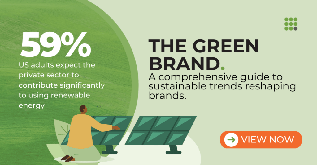
The Green Brand Sustainability Study

Tools for Displayed Thinking

Physical Tools

  1. Whiteboards:
    • Description: Whiteboards are versatile, reusable writing surfaces commonly found in meeting rooms. They allow for easy writing, drawing, and erasing, making them ideal for dynamic discussions.
    • Benefits: They encourage participation, are easy to update in real-time, and provide a large surface for collaborative brainstorming.
  2. Flipcharts:
    • Description: Flipcharts consist of large pads of paper mounted on an easel. Pages can be flipped over as needed, allowing for a sequential presentation of ideas.
    • Benefits: They are portable, provide a permanent record of discussions, and help create structured lists and diagrams that can be referenced throughout the meeting.
  3. Corkboards:
    • Description: Corkboards are bulletin boards made of cork material, allowing users to pin up papers, notes, and other visual aids.
    • Benefits: They are excellent for displaying and rearranging ideas, visual aids, and other documents. Corkboards provide a tactile way to organize information and encourage hands-on interaction.
  4. Markers and Sticky Notes:
    • Description: These are essential accessories for whiteboards and flipcharts. Markers allow for colorful writing and drawing, while sticky notes can be used to jot down individual ideas and move them around easily.
    • Benefits: They enhance the visual appeal of the discussion and make it easy to categorize and reorganize ideas.

Digital Tools

  1. Tablets with Stylus Support:
    • Examples: Apple iPad with Apple Pencil and the Microsoft Surface with Surface Pen.
    • Description: Tablets with stylus support allow for digital drawing and note-taking, simulating the experience of writing on paper.
    • Benefits: They are portable, provide a paperless option for displayed thinking, and make it easy to save, share, and edit visual notes.
  2. Digital Whiteboards:
    • Example: Google Jamboard, Microsoft Whiteboard.
    • Description: Digital whiteboards are interactive screens that can be used for drawing, writing, and collaborating in real-time, both in-person and remotely.
    • Benefits: They facilitate collaboration among geographically dispersed teams, allow for easy integration of multimedia elements, and provide a permanent digital record of the session.
  3. Drawing and Note-Taking Apps:
    • Example: Procreate, Notability, OneNote.
    • Description: These apps provide platforms for digital drawing and note-taking, offering a variety of tools for creating visual aids.
    • Benefits: They offer advanced features like layers, text integration, and export options, making it easy to create professional and shareable visuals.
  4. Mind Mapping Software:
    • Example: MindMeister, XMind.
    • Description: Mind mapping software helps create visual representations of ideas, showing the relationships between different concepts.
    • Benefits: They are handy for brainstorming sessions, enabling users to quickly organize thoughts and see connections that might not be immediately obvious.
  5. Project Management Tools:
    • Example: Trello, Asana.
    • Description: While primarily used for project management, these tools often include features for visualizing tasks and workflows, such as boards and cards.
    • Benefits: They help teams track progress visually, assign tasks, and ensure everyone is aligned on project goals and timelines.

By integrating these physical and digital tools into their workflows, market researchers can leverage the benefits of displayed thinking to enhance communication, collaboration, and creativity. These tools provide various options to suit different meeting styles and needs, ensuring that ideas are effectively captured and shared.

Final Thoughts

Displayed thinking isn’t just a proper technique; it’s a game-changer for market researchers and professionals. If you’ve ever felt the frustration of misaligned visions in meetings, adopting displayed thinking can transform those experiences. Industry experiences back this up. According to a study published in the Harvard Business Review, teams that used visual tools for problem-solving reported higher levels of creativity and efficiency—by making ideas visible, displayed thinking bridges the gap between individual perceptions and collective understanding, fostering a more collaborative and innovative environment.

Consider integrating displayed thinking into your workflows. Start by equipping your meeting spaces with essential physical tools like whiteboards and flipcharts. Explore digital tools that offer flexibility and accessibility, such as tablets with stylus support and interactive whiteboards. Embrace the power of visual communication to enhance your meetings, making them more engaging and productive.

By adopting displayed thinking, you will improve communication and idea generation and create a shared vision that aligns team efforts and drives success. Take the first step today and transform how you and your team brainstorm, discuss, and implement ideas. The benefits are clear, and the impact on your projects will be profound.

Imagine watching a movie with stunning cinematography—breathtaking visuals, vibrant colors, and meticulously framed scenes. However, as beautiful as the film looks, you soon realize there’s little to no plot. The characters are underdeveloped, the storyline is incoherent, and the dialogue is forgettable. Despite the visual feast, the movie fails to engage because it lacks substance.

This trend mirrors what’s happening in data storytelling today. Many believe data storytelling is about creating attractive charts and graphs. While these visuals make complex data easier to understand, they miss out on the crucial elements of data and narrative that complete the story.

Just as a visually stunning movie without a solid plot and character development falls flat, a data story that relies solely on visuals fails to convey meaningful insights. Visuals alone cannot provide context or explain the significance of the data. They need to be part of a larger narrative that guides the audience through the insights and their implications.

Moreover, this overemphasis on visualization can lead to fragmented and disjointed stories. Individual charts might show exciting data points, but without a cohesive narrative, they remain isolated observations rather than a unified story. This approach can confuse rather than inform, leaving the audience without a clear understanding of the message.

Overemphasis on visualization can also lead to inadequate training for data professionals. Many organizations pour resources into visualization tools and techniques, often at the expense of developing data analysis and narrative crafting skills. This imbalance hampers the ability to produce impactful data stories that foster understanding and prompt action.

So, while data visualization is an essential aspect of data storytelling, it is just one part of a larger process. A successful data story requires a balanced approach integrating data, narrative, and visuals. By broadening our focus beyond just the visuals, we can unlock the full potential of data storytelling and communicate insights more effectively.

Understanding Data Storytelling

Data storytelling is the art of communicating insights from data through a blend of data, narrative, and visuals. These three components work together to create a compelling and comprehensive story that informs and engages the audience.

Data

Data forms the foundation of any data story. It consists of the facts, figures, and statistics that provide the evidence needed to support the narrative. Without accurate and relevant data, the story lacks credibility and substance. Data must be carefully analyzed and interpreted to uncover meaningful insights that drive decision-making and action.

Narrative

The narrative is the storyline that ties the data together. It provides context, explains the significance of the data, and guides the audience through the insights in a logical and engaging manner. A well-crafted narrative ensures that the data is not just a collection of isolated points but a coherent story that highlights trends, patterns, and key takeaways. The narrative adds depth and meaning to the data, making it more relatable and easier to understand.

Visuals

Visuals, such as charts, graphs, and images, play a crucial role in data storytelling by making complex data more accessible and easier to comprehend. They help to highlight important insights, illustrate trends, and provide visual context to the narrative. However, visuals should complement the data and narrative, not overshadow them. Compelling visuals enhance the story and aid communication, but they must be used thoughtfully and strategically to avoid confusion and misinterpretation.

The Synergy of Data, Narrative, and Visuals

When data, narrative, and visuals are combined effectively, they create a powerful data story. Data provides the evidence, the narrative delivers the message, and the visuals make the information engaging and accessible. Each component supports and enhances the others, ensuring the story is informative and compelling.

A successful data story is one where the audience can quickly grasp the insights and understand their implications. It moves beyond simply presenting data points to telling a story that resonates with the audience, drives understanding, and prompts action. By integrating data, narrative, and visuals, data storytelling transforms raw data into meaningful and actionable insights, making it a vital tool for communication in today’s data-driven world.

The Misconceptions about Data Visualization

Misconception 1: Every Data Chart Tells a Story

Data charts and graphs help present information but don’t tell a story by themselves. A single chart might show a trend or an interesting point, but without context and narrative, it can’t fully convey the data’s significance. Charts alone are static representations without the narrative needed to explain their relevance and guide the audience through the insights.

Misconception 2: A Collection of Charts Equals a Data Story

People often think that a collection of loosely connected charts can tell a complete data story. But, like random movie scenes that don’t make a coherent film, unrelated charts fail to create a cohesive narrative. While each chart might contain valuable data, without a unified storyline, the audience is left to piece together the insights, leading to confusion and misinterpretation.

The Importance of Narrative

A strong narrative is essential to transform data charts into a compelling data story. The narrative weaves together the individual data points, providing context and explaining the significance of the visuals. It guides the audience through the data, highlighting key insights and their implications. A well-constructed narrative ensures that the data is not just a series of disjointed observations but a coherent story communicating a clear and meaningful message.

The Role of Context

Context is crucial in data storytelling. A single chart might show a spike in sales, but without context, it is difficult to understand why this spike occurred and what it means for the business. The narrative provides this context, explaining the factors behind the data and its broader implications. This context turns raw data into actionable insights, enabling the audience to make informed decisions.

The Need for Coherence

A complete data story requires coherence—each element must connect logically to the others. This coherence is achieved through a narrative that ties the data points together and visuals that support and enhance the narrative. Without coherence, the audience may find the story fragmented and challenging to follow, diminishing the impact of the data.

The Role of Dashboards in Data Storytelling

Dashboards have become a staple in data analysis and business intelligence. They offer a dynamic way to monitor key metrics, track performance, and explore data in real-time. However, while dashboards are powerful tools for data exploration, they differ significantly from data stories.

Dashboards: Tools for Data Exploration

Dashboards are designed to provide a broad view of multiple data points and metrics simultaneously. They offer interactive elements, allowing users to drill down into specific areas of interest, filter data, and view trends over time. This flexibility makes dashboards ideal for exploring data, identifying patterns, and gaining a high-level overview of performance indicators.

Key Characteristics of Dashboards

  1. Real-Time Monitoring: Dashboards update in real-time or near real-time, offering the latest data insights as they happen. This feature is invaluable for continuous monitoring and quick decision-making.
  2. Interactive Elements: Users can interact with dashboards by applying filters, adjusting timeframes, and drilling into detailed views. This interactivity supports in-depth exploration and customized analysis.
  3. Multiple Data Sources: Dashboards often integrate data from various sources, presenting a comprehensive view of different metrics and KPIs in one place. This holistic view aids in comparing and correlating different data sets.

Data Stories: Focused and Cohesive Narratives

Unlike dashboards, data stories are designed to convey specific insights through a structured narrative. They guide the audience through a series of data points, emphasizing the connections and implications of the data. A data story has a beginning, middle, and end, with each element building on the previous one to deliver a cohesive and compelling message.

Key Characteristics of Data Stories

  1. Structured Narrative: Data stories follow a clear storyline with a logical flow that guides the audience through the insights. This structure helps to contextualize the data and highlight its significance.
  2. Targeted Insights: Data stories focus on specific insights or findings, explaining their relevance and implications in detail. This targeted approach ensures that the audience grasps the key messages and their impact.
  3. Emphasis on Communication: The primary goal of data stories is to communicate insights effectively, often using a combination of data, narrative, and visuals. This balanced approach enhances understanding and engagement.

Why Dashboards Are Suited for Exploration, Not Storytelling

  1. Fragmented View: Dashboards simultaneously present multiple metrics and data points, which can be overwhelming and challenging to interpret without additional context. This fragmented view is excellent for exploration but less effective for delivering a cohesive narrative.
  2. Lack of Narrative: While dashboards allow users to explore data, they do not inherently provide a narrative. Users must piece together insights on their own, which can lead to varied interpretations and potentially missed connections.
  3. Focus on Monitoring: Dashboards’ primary function is to monitor and explore data continuously. They are designed for ongoing analysis rather than presenting a one-time, well-crafted story.

The Three Key Elements of Data Storytelling

Data storytelling is a powerful way to communicate insights, but it relies on effectively integrating three key elements: data, narrative, and visuals. Each component uniquely contributes to crafting a compelling story that informs and engages the audience.

Data: The Foundation

Data forms the foundation of any data story, providing the factual basis that supports the narrative and adds credibility to the insights. Without accurate and relevant data, the story lacks substance and can fall apart. Robust data analysis is crucial to uncovering meaningful patterns and trends, ensuring that insights are trustworthy and can inform decision-making.

Narrative: The Guide

The narrative ties the data into a coherent story, providing context and meaning. It guides the audience through the insights, explaining their importance and implications. A structured narrative highlights key points and keeps the audience engaged, transforming raw data into an informative, compelling, and easy-to-follow story. A well-crafted narrative presents data logically, making the insights clear and impactful.

Visuals: The Enhancer

Visuals play a crucial role in making data accessible and understandable. Charts, graphs, and other visual aids can quickly convey complex information and highlight important trends. However, visuals should complement the data and narrative, not overshadow them. Compelling visuals enhance the storytelling by making data more relatable and easier to interpret, but they should always support the story, not dominate it. Over-reliance on visuals can detract from the message if poorly integrated with the narrative and data.

AspectDataNarrativeVisuals
RoleProvides the factual basis and credibilityGuides the audience through the insightsEnhances understanding and accessibility
ImportanceEssential for trustworthy and reliable insightsCrucial for context and meaningful communicationImportant for clarity and engagement
FunctionForms the core content of the storyWeaves the data into a cohesive and compelling storyIllustrates data trends and patterns visually
DependencyMust be accurate and relevant to be effectiveRelies on data for substance and contextShould complement and support data and narrative
ChallengesRequires thorough analysis and validationNeeds to be structured and engagingCan overshadow data if overemphasized
ExamplesStatistics, figures, metricsExplanations, contextual information, storytellingCharts, graphs, infographics
OutcomeCredible and actionable insightsClear and impactful messageVisual clarity and enhanced comprehension

A Balanced Perspective on Data Storytelling

To fully leverage data storytelling, it is crucial to adopt a balanced approach that integrates data, narrative, and visuals. This contrasts with a visualization-centric view, which overly focuses on visuals at the expense of narrative and data quality. A balanced approach ensures that each element complements the others, leading to more effective communication of insights.

Visualization-Centric View vs. Balanced Approach

Visualization-Centric View

  • Emphasis on Charts and Graphs: A visualization-centric approach prioritizes the design and aesthetics of charts and graphs. The primary goal is to create visually appealing representations of data.
  • Potential Overlooks: This view can overlook the importance of context and storytelling, leading to visually impressive charts lacking depth and meaning.
  • Fragmented Insights: The data presented can seem disjointed without a strong narrative. Individual charts may not convey how they relate to one another or the overarching message.

Balanced Approach

  • Integration of Elements: A balanced approach seamlessly integrates data, narrative, and visuals. Each element is given equal importance, ensuring a well-rounded and coherent story.
  • Context and Meaning: The narrative provides context and meaning to the data, explaining why the insights matter and how they impact the audience. This makes the story more engaging and easier to understand.
  • Coherent Storytelling: By combining well-analyzed data with a compelling narrative and supportive visuals, the story is presented cohesively. This helps the audience grasp the complete picture and the implications of the insights.

Examples of a Balanced Approach

Example 1: Market Research Report

  • Data: A company conducts a market survey and gathers extensive data on consumer preferences and buying behaviors.
  • Narrative: The report begins with an introduction to the market trends and the purpose of the survey. It then guides the reader through crucial findings, explaining the significance of each trend and how it affects the market landscape.
  • Visuals: Charts and graphs highlight important data points, such as shifts in consumer preferences over time or comparisons between different demographics. These visuals support the narrative, making complex data easier to digest.

Example 2: Business Performance Review

  • Data: A quarterly business review includes performance metrics such as sales figures, customer satisfaction scores, and operational efficiency.
  • Narrative: The review starts with an overview of the company’s goals and objectives. It then narrates the story of the quarter’s performance, linking the data to specific business strategies and initiatives.
  • Visuals: Visual aids like bar charts, line graphs, and pie charts illustrate the performance metrics. They are strategically placed within the narrative to emphasize critical points and trends, helping stakeholders understand the outcomes and future implications.

Example 3: Health Research Study

  • Data: Researchers collect data on the effects of a new medication on patient health outcomes.
  • Narrative: The study report outlines the research hypothesis, methodology, and key findings. It narrates the journey from hypothesis to conclusion, explaining the significance of the results and their impact on medical practice.
  • Visuals: Tables, graphs, and infographics summarize the data, showing the medication’s effects on various health parameters. These visuals enhance the narrative, making the scientific data accessible to a broader audience.

Shifting Focus: Effective Communication

To maximize the impact of data storytelling, organizations must see it as a comprehensive communication tool. This goes beyond just creating attractive visuals and emphasizes integrating data, narrative, and visuals to convey insights effectively. Shifting to this holistic approach is crucial for effective communication and avoiding common pitfalls.

Recognizing Data Storytelling as a Comprehensive Tool

Data storytelling is a communication method that combines three critical elements: data, narrative, and visuals. Each component is vital in conveying insights and making the story informative and engaging. When organizations understand and embrace this comprehensive approach, they can communicate complex information more clearly and persuasively.

  • Data: Provides the factual foundation and credibility.
  • Narrative: Adds context and meaning, guiding the audience through the insights.
  • Visuals: Enhances understanding and engagement, making complex data accessible.

Potential Pitfalls of Focusing Narrowly on Visualization Training

Many organizations invest heavily in visualization training, believing that creating visually appealing charts and graphs is the key to effective data storytelling. However, this narrow focus can lead to several pitfalls:

  1. Inadequate Context and Meaning: Without a strong narrative, data visualizations can lack context and fail to convey the significance of the insights. Charts alone cannot explain why the data matters or how it impacts the audience, resulting in a superficial understanding of the information presented.
  2. Fragmented Insights: A collection of visually appealing charts may not form a cohesive story. Without a narrative to tie the data points together, the audience may struggle to see the connections and overarching message. This fragmentation can lead to confusion and misinterpretation.
  3. Underdeveloped Data Skills: Overemphasizing visualization training can lead to underdeveloped data analysis skills. Accurate and insightful data analysis is the foundation of any data story. Without solid data skills, the visualizations may be based on incomplete or incorrect interpretations, undermining the story’s credibility.
  4. Missed Opportunities for Engagement: A compelling narrative is crucial for engaging the audience and making the data relatable. Without narrative skills, data professionals may miss opportunities to connect with their audience more deeply. Engaging stories can inspire action and drive decision-making more effectively than standalone visuals.

The Need for a Balanced Approach

Brands must shift their focus to a balanced approach that integrates data, narrative, and visuals. This comprehensive training ensures that data professionals are equipped with the necessary skills to create compelling data stories:

  • Data Analysis: Training should emphasize the importance of thorough data analysis, ensuring that insights are accurate, relevant, and actionable.
  • Narrative Construction: Developing narrative skills is essential for crafting stories that provide context, highlight significance, and guide the audience through the insights.
  • Visualization Techniques: While visualization is important, it should be taught as one component of a larger storytelling framework, complementing the data and narrative.

By adopting this balanced approach, organizations can enhance their data storytelling capabilities, leading to more effective communication and better decision-making.

Embracing a Balanced Approach

The prevailing misconception that data storytelling is synonymous with data visualization undermines its true potential. Compelling data storytelling is not just about creating eye-catching charts; it’s about weaving together data, narrative, and visuals to communicate insights compellingly and clearly.

A balanced approach to data storytelling is crucial. Data provides the factual foundation, the narrative guides the audience through the insights, and visuals enhance understanding. Neglecting any of these elements can lead to fragmented, superficial stories that fail to engage and inform.

Brands must shift their focus from purely visualization-centric training to a more comprehensive model that equally values data analysis and narrative construction. This holistic view ensures that data stories are visually appealing but also meaningful and actionable.

Adopting this balanced perspective transforms data from mere numbers into powerful stories that drive decision-making and inspire change. It’s time for organizations to recognize the full scope of data storytelling and invest in developing the skills that bring data to life.

Customer success teams are bombarded with unprecedented data about how their customers interact with products and services. Every minute, vast information streams are generated from multiple sources—social media feeds, business transactions, Internet of Things (IoT) devices, and more. This relentless influx, often called “information overload,” poses a significant challenge: how can we sift through, interpret, and harness this data effectively? 

The answer lies not just in the data itself but in its presentation.

More than ever, the art of visualizing data to craft compelling stories is becoming pivotal. It’s about transforming numbers and metrics into narratives that resonate deeply.

For customer-centric brands, the core objective is to forge robust and enduring relationships. Achieving this requires understanding your customers’ needs, challenges, and aspirations. But it’s not just about gathering insights—it’s about communicating them. Effective storytelling and data visualization don’t just convey facts; they connect, persuade, and drive action. These skills empower customer success teams to act as invaluable bridges between customer data and strategic outcomes. 

This is where presenting the insights comes into play.

Presentation isn’t just about making data look good; it’s a key factor in how effectively it is understood and used in decision-making. Imagine being in the market research world, where every bit of consumer behavior, every prediction of where the market is heading, and every strategy crafted is crucial. The clarity with which we convey our findings doesn’t just add value—it’s often what separates a groundbreaking insight from a costly oversight.

But here’s the kicker: having mountains of data isn’t enough. What matters is how quickly and accurately stakeholders can digest this information and grasp its implications. This is where the art of presentation shines—through eye-catching charts, detailed graphs, or interactive dashboards. How we present our data becomes just as critical as the data points themselves. It’s not just about showing numbers; it’s about telling a compelling, understandable, and actionable story.

Given this context, effective visual communication and data visualization emerge as critical elements in market research. They are not merely tools for beautification but essential means for unlocking and communicating insights. Well-designed visuals can distill complex data into clear, impactful stories that engage stakeholders and drive strategic decisions. 

The Power of Visual Storytelling in Data Presentation and Market Research

Visual storytelling in market research refers to using graphic elements to incorporate data into an engaging and informative narrative, making complex information accessible to all stakeholders regardless of their expertise in data analysis. Researchers can highlight trends, patterns, and anomalies by employing visuals such as charts, infographics, and animations, making it easier for decision-makers to grasp subtle nuances and take informed actions.

So, how do you tell a compelling story?

Here are several dynamic ways a brand can leverage storytelling with customer data:

  • Creating Personas: Develop personas with fictional biographies to vividly represent different customer segments.
  • User Experience Narratives: Illustrate common challenges through a typical user’s experience, providing a relatable context.
  • Customer Case Studies: Explore real-life scenarios where customers successfully navigated obstacles, showcasing the effectiveness of your solutions.
  • Narrative Journey Maps: Construct journey maps that outline the customer’s path, complete with narrative arcs and plot points that tell a compelling story.
  • Year-in-the-Life Analyses: Craft “year-in-the-life” stories to highlight significant milestones and achievements over an annual cycle.

Once you have visualized your data using sophisticated tools, here are effective techniques to craft engaging narratives:

  • Decoding Data Insights: Clearly explain the data’s relevance and significance to your audience, offering essential background to frame insights within a larger context.
  • Bringing Data to Life: Use specific customer stories and examples to humanize the data, fostering a personal connection with your audience.
  • Narrative Structure in Data: Organize your presentation like a journey with a clear beginning, middle, and end, allowing the audience to follow and absorb key insights easily.
  • Enhancing Visuals with Annotations: Utilize annotations, callouts, and highlights on your charts and visuals to spotlight crucial data points and trends.
  • Harmonizing Visual Design: Maintain consistent branding with uniform fonts, colors, logos, and design elements throughout your presentations for better retention and a professional appearance.
  • Streamlining Information: Focus on clarity by limiting the cognitive load; avoid bombarding the audience with too much text, complex visuals, or information overload.
  • Driving Actions with Data: End each presentation with decisive, actionable steps based on the data, providing concrete recommendations for stakeholders to implement.

— Ani V, Head of Design, Kadence International

Using Visual Storytelling to Transform Complex Data into Understandable Narratives

Visual storytelling in market research can take many forms, each simplifying and enhancing the comprehension of complex datasets. For instance, a time-series graph can illustrate sales trends over multiple years, highlighting seasonal spikes or declines that might be lost in a table of numbers. 

Infographics are particularly useful in displaying consumer demographics or survey results, using icons and varied colors to segment data visually and enhance readability. 

Another example is heat maps, which can indicate geographic concentrations of market activity or consumer preferences, providing a quick visual interpretation of data that might otherwise require complex statistical analysis.

Consider a traditional market research report on consumer satisfaction that includes pages of tabulated survey responses—scores from 1 to 5 across various service dimensions like timeliness, quality, and customer support. The data, while comprehensive, is dense and cumbersome, requiring stakeholders to scrutinize numerous tables to draw meaningful conclusions.

Now, reimagine that same data presented through an interactive dashboard. 

Each service dimension is visualized using star ratings, color codes, and sliders to depict satisfaction levels. Interactive elements allow users to filter results by demographic criteria like age, gender, and location, providing instant visual segmentation. Comparative bar graphs summarize the overall performance against competitors, highlighting strengths and areas for improvement.

This transformation through visual storytelling not only makes the data more digestible but also more engaging. Stakeholders can instantly identify key areas of concern and strength, facilitating quicker and more targeted decision-making. 

Here’s an example of a dashboard showing consumer sentiment analysis gathered from social media and survey data, with sales forecasts.

Let’s say a brand is launching a new product. The marketing team could present a dashboard integrating consumer sentiment analysis from social media and survey data with sales forecasts. This visual presentation could use sentiment gauges and trend lines that make it easy for the non-technical executive teams to understand consumer enthusiasm and its potential impact on sales. The clear visualization of positive sentiment aligned with strategic launch locations will help secure executive buy-in for the proposed marketing plan, leading to a successful product rollout.

Design Principles for Effective Data Visualization

Key Design Principles: Simplicity, Clarity, and Engagement

Effective data visualization is founded on three fundamental principles: simplicity, clarity, and engagement. 

Simplicity involves stripping down the visualization to its essential elements, avoiding over-complication that can distract or confuse the viewer. 

Clarity ensures that every visual element communicates information in a straightforward manner, making it easily understandable at a glance. 

Engagement pertains to crafting visuals that capture and hold the audience’s attention, encouraging them to explore the data further.

-Hasen Morad, Senior Data Visualization Analyst – Americas at Kadence

In market research, applying these principles can dramatically enhance the utility and impact of presented data:

  • Simplicity in market research visualization means presenting data without unnecessary complexity, focusing on key insights. This is crucial when dealing with diverse stakeholder groups, ensuring everyone can understand the findings regardless of their analytical background.
  • Clarity is achieved by organizing data logically and appropriately using visual elements like scales and legends. Clear visualizations help stakeholders quickly grasp what the data says and the implications for the brand.
  • Engagement is fostered by designing visually appealing studies that narrate a story, making the exploration of data not just insightful but also enjoyable. Engaging visuals can lead to deeper interactions with the data, prompting stakeholders to ask questions and seek further analysis.

Visual Examples: Color Coding, Layout Strategies, and the Use of Icons and Graphs

When designed according to simplicity, clarity, and engagement, the following visual elements transform raw data into compelling visual stories that facilitate better understanding, prompt insightful questions, and drive informed decision-making in market research.

Effective data visualization in market research can be illustrated through specific visual techniques:

  • Color Coding: Utilizing different colors can dramatically enhance the readability and effectiveness of data presentation. For instance, using a consistent color scheme to represent different product categories across various visuals (charts, graphs) helps maintain continuity and eases understanding. Colors can also highlight anomalies or important data points, directing viewers’ attention to key insights.
  • Layout Strategies: The arrangement of visual elements is critical in how information is perceived. For example, the strategic placement of charts and key insights in a dashboard can guide the viewer’s eye in a logical flow from general overviews to detailed analyses. This systematic arrangement ensures stakeholders can follow the narrative woven through the data.
  • Use of Icons and Graphs: Icons are an effective way to communicate concepts quickly. For example, using a shopping cart icon to represent sales data immediately informs the viewer of the context. Graphs such as bar charts for comparison, line graphs for trends over time, and pie charts for market share distributions are indispensable tools in market research. They transform numbers into visually intuitive information, making complex data accessible at a glance.

Techniques and Tools for Data Visualization

Several tools and software stand out in market research for their robust data visualization capabilities, making them indispensable for analysts and researchers. 

Tableau is highly regarded for its ability to create complex and visually appealing data visualizations easily. It offers extensive customization options and powerful analytics, ideal for deep insights into consumer data and market trends. 

Microsoft Power BI is another leading tool known for its integration with other Microsoft products and services, which facilitates a seamless flow of data within organizations. 

Advanced Techniques Like Interactive Dashboards and Real-Time Data Feeds

Interactive dashboards are a leap forward in how data interacts within market research. These dashboards allow users to drill down into specifics by interacting with the data, such as filtering by demographic factors, periods, or other relevant segmentations. This interactivity ensures stakeholders can manipulate their views to answer specific questions or explore hypotheses about market behavior. 

Real-time data feeds are another advanced technique where live data is streamed directly into dashboards, providing the latest information at a glance. This is especially valuable in dynamic markets where conditions change rapidly, and up-to-the-minute data can influence key business decisions.

Incorporating Multimedia Elements Such as Videos and Interactive Maps

Multimedia elements can significantly enhance the effectiveness of data visualizations by providing more engaging ways to present and interact with information. Videos, for instance, can narrate the story behind the data, offering a dynamic and engaging way to present findings or explain complex processes. 

Interactive maps are particularly useful in market research for geospatial analysis, where data related to consumer behavior, sales distribution, or market penetration needs to be contextualized geographically. These maps allow stakeholders to visually explore variations across different regions, facilitating a better understanding of market dynamics on a global or local scale.

Together, these tools and techniques create a comprehensive toolkit for market researchers, enabling them to transform raw data into actionable insights through sophisticated, engaging, and highly informative visualizations. This not only aids in better understanding and decision-making but also ensures that insights are communicated effectively to all stakeholders involved.

Enhancing Stakeholder Engagement through Visualization

Visual data is critical in bridging the gap between complex market research findings and various stakeholder groups, including executives, product managers, marketing teams, and investors. Each group has distinct informational needs and decision-making responsibilities that visualizations can cater to by customizing the data’s presentation. For instance, executives might need high-level dashboards focusing on ROI and market growth, while product managers may require detailed user engagement statistics. Effective visuals grab attention, enhance comprehension, and make the data not only accessible but also actionable across these diverse groups.

Strategies for Presenting Data to Non-Technical Audiences

Presenting data to non-technical audiences involves a few key strategies to ensure clarity and engagement:

  • Simplify the Information: Use clear, straightforward visuals like pie charts for percentage distributions or bar graphs for comparisons. Avoid clutter and focus on one main idea per visual.
  • Tell a Story with Data: Organize the presentation to follow a narrative arc that leads the audience through the data in a logical, engaging manner. Begin with setting the context, presenting the core data, and concluding with actionable insights.
  • Use Annotations and Guided Walkthroughs: Annotations can help explain unfamiliar terms or highlight key points. Guided walkthroughs during live presentations can further aid understanding by addressing parts of the data as they relate to the stakeholders’ interests.
  • Interactive Elements: Allow stakeholders to interact with the data through tools like sliders or filters. This interaction interests them and lets them explore the data at their own pace and according to their personal or departmental focus.

Examples of Effective Stakeholder Presentations and the Results

Here’s an example of our study unveiling opportunities for animal health brands.

We recently conducted a research project in the UK, investigating how brands can assist Vets in the current economic climate by comprehending their difficulties and connection with pet owners. Our team created an infographic with the findings, which you can check out here

Customer-Centric Visualization Strategies

In market research, placing the customer at the heart of data stories is essential for creating products and services that truly resonate with target audiences. 

Customer-centric visualizations focus on translating customer behaviors, preferences, and feedback into visual formats that all business areas can easily understand and act upon. This approach ensures that the customer’s voice is heard and valued and aligns business strategies with customer needs, enhancing customer satisfaction and loyalty and driving business growth.

Techniques for Visualizing Customer Data to Reveal Behaviors and Preferences

Effective techniques for visualizing customer data include:

  • Segmentation Heatmaps: Use heatmaps to show how customer segments interact with various product or service aspects. For example, color intensities can indicate the frequency of use or preference levels across different demographics.
  • Customer Journey Maps: Illustrate the customer’s journey from awareness to purchase and beyond with detailed visual maps highlighting pain points, satisfaction peaks, and areas for improvement.
  • Preference Clusters: Utilize cluster analysis visuals to group customers by shared preferences or behaviors, depicted through scatter plots or bubble charts, helping brands tailor marketing and product development strategies.
  • Sentiment Analysis: Graph customer sentiment from reviews and social media on a sentiment scale. This can be visualized through word clouds for qualitative data or plotted over time to detect changes in customer sentiment.

Measuring the Impact of Good Data Visualization

Criteria for Evaluating the Effectiveness of a Data Visualization

The effectiveness of data visualization can be assessed through several key criteria:

  • Accuracy: The visualization must accurately represent the underlying data without distorting the truth. This is fundamental to maintaining the integrity of decisions based on the visual.
  • Clarity: It should be easy for the viewer to understand the visualization without extensive explanations. Clear visuals avoid excessive complexity and focus on conveying the main message succinctly.
  • Utility: The visualization should fulfill its intended purpose, whether it’s to reveal trends, compare data, or highlight specific metrics. Its utility is measured by its ability to drive insights and actions effectively.
  • Aesthetics: While function is more critical than form, a well-designed, aesthetically pleasing visualization can enhance engagement and comprehension.
  • Accessibility: Good data visualizations are accessible to all users, including those with disabilities. This includes considerations for color blindness and providing textual alternatives or descriptions where necessary.

Metrics and Feedback Mechanisms to Assess Visualization Impact on Decision-Making

To measure the impact of data visualization on decision-making, several metrics and feedback mechanisms can be employed:

  • User Engagement Metrics: Track how users interact with visualizations, including time spent, interaction points, and frequency of access. High engagement often indicates that the visualization is effective and useful.
  • Decision Impact Surveys: After decision-making meetings or presentations, survey stakeholders to gather feedback on how the visualizations influenced their understanding and decisions.
  • A/B Testing: In situations where decision pathways can vary, employ A/B testing to compare the outcomes of decisions made with different visualizations.
  • Conversion Rates: In marketing or sales contexts, measure how changes in visualization strategies affect conversion rates, signifying a direct impact on business outcomes.

Testimonials and Expert Opinions on Successful Visualizations

Testimonials and expert opinions can provide qualitative insights into the effectiveness of data visualizations:

  • Expert Reviews: Have data visualization experts review and provide feedback on the visuals, offering insights into their effectiveness and adherence to best practices.
  • Client Testimonials: Gather testimonials from clients or internal stakeholders who have used the visualizations in their decision-making processes. Positive feedback can validate the effectiveness of the visual designs.
  • Case Studies: Publish case studies that detail the use of specific visualizations and their impact on business decisions and outcomes. This not only serves as evidence of success but also provides a blueprint for similar applications in the future.

Challenges and Considerations in Designing Data Visualizations

Effective data visualization is as much an art as it is a science, but certain common pitfalls can undermine its success:

  • Overcomplication: Adding too many elements or too much data can overwhelm the viewer, making it difficult to discern the key messages. Simplification is often more effective, focusing on what is most important.
  • Misleading Graphics: Inaccurate scales, inappropriate graph types, or cherry-picked data can mislead viewers, either intentionally or unintentionally. For instance, using a truncated y-axis can exaggerate minor differences in data, misleading viewers about the significance of the results.
  • Ignoring Context: Visualizations that fail to consider the audience’s knowledge or expectations can be confusing or misinterpreted. Tailoring the visualization to fit the context and the audience’s needs is crucial for effective communication.
  • Style Over Substance: Prioritizing aesthetic appeal over clarity and functionality can distract from the data’s core insights, potentially leading to misinterpretations or overlooked details.

Ethical Considerations in How Data is Presented

The ethical presentation of data is paramount in maintaining trust and integrity in market research:

  • Transparency: Always clearly explain how data was collected, analyzed, and visualized. Any limitations or biases in the data should be openly discussed.
  • Accuracy: Ensure all visual representations are true to the data. This includes selecting the appropriate type of graph or chart that accurately reflects the relationships and proportions in the data.
  • Privacy: Be mindful of privacy concerns, especially when handling sensitive or personal data. Visualizations should never reveal individual identities unless explicitly authorized.
  • Fair Representation: Avoid visualizations construed as discriminatory or biased against certain groups. Ensure that data visualizations are inclusive and represent diverse groups fairly.
green-fintech-trends

Future Trends in Data Visualization and Anticipated Challenges

As market research continues to evolve, several trends and challenges in data visualization are anticipated:

  • Increased Use of AI and Machine Learning: These technologies will drive the development of more sophisticated data analysis and visualization tools, offering predictive insights and automated pattern recognition.
  • Interactive and Real-Time Data: The demand for interactive and real-time data visualizations will increase as businesses seek more dynamic ways to interact with data and make faster decisions.
  • Integration with Virtual and Augmented Reality: VR and AR could revolutionize data visualization by providing immersive environments to explore data in three-dimensional spaces, offering new perspectives and deeper insights.
  • Data Literacy: As data becomes more central to business operations, improving data literacy across all levels of an organization will be crucial. Visualizations will play a key role in educating and informing stakeholders, necessitating designs that are both informative and easy to understand.

Final Thoughts

Visual storytelling through data visualization has proven to be a transformative power in market research. Visualizations clarify and amplify the underlying stories data can tell by turning complex datasets into comprehensible, engaging narratives. These visual narratives help stakeholders across different levels understand intricate details about consumer behavior, market trends, and operational efficiencies, fostering informed decision-making.

However, the effectiveness of these visualizations depends largely on the skill with which they are crafted. Therefore, market researchers must prioritize their development in design and visualization techniques. Enhancing these skills will improve the quality of data presentation and expand the researcher’s ability to interpret and communicate insights effectively. 

Looking ahead, technology integration in data visualization is set to deepen. With advancements in AI, machine learning, and real-time data processing, the future of visual storytelling will likely feature even more dynamic and interactive elements. 

These technologies will enable researchers to create more nuanced and powerful visualizations to predict trends and model potential outcomes, making data a lens to the present and a gateway to the future.

The enduring impact of well-crafted visual data presentations will remain a cornerstone of effective market research. By embracing these tools and technologies, market researchers can ensure they keep pace with the digital age and lead the charge in transforming data into action.

Strategic decision-making based on data is key to achieving competitive advantage in global business. Yet, the journey from raw data to actionable insight is often fraught with challenges, especially when ensuring these insights resonate with and engage key organizational stakeholders. 

Drawing from my experience working with brands across various industries, I’ve observed a common hurdle: the traditional methods of data presentation, while informative, frequently need to captivate or inspire the intended audience. This understanding has propelled us at Kadence International to pioneer an innovative approach, blending our deep market research expertise with the transformative power of visual design to bridge this crucial gap.

The Art and Science of Visual Storytelling: Crafting Engaging Narratives from Data 

The norm in many organizations relies heavily on text-heavy PowerPoint slides to communicate research findings and insights. While this method serves its purpose, it often needs more dynamism to engage and motivate internal stakeholders. 

In my journey of collaborating with diverse teams, the power of visual communication to elevate data into compelling, memorable narratives has become unmistakably clear. By stepping beyond the traditional confines of presentation software and embracing a more creative, multidisciplinary approach, we’ve crafted stories that inform and emotionally resonate, ensuring that vital insights are not merely shared but felt and remembered.

Visual storytelling transcends the mere presentation of data; it involves threading insights into a narrative that captures the essence of the information and its implications. This narrative approach is grounded in the understanding that humans are inherently drawn to stories. We find stories more engaging, memorable, and persuasive than abstract data. The challenge and opportunity for market researchers and strategists lie in harnessing this natural inclination toward stories to make complex data accessible and compelling.

The process begins with identifying the core message or insight that needs to be communicated. This is not merely about summarizing data points but about distilling the core of the research into a central theme that can form the backbone of the narrative. From there, it’s about building a story that guides the audience through the data, highlighting key findings and drawing connections to the broader business context. This structure makes the information more digestible and more impactful, as it situates the data within a relevant and meaningful framework to the audience.

CASE STUDY 1

Client: Bloomberg

Background: An infographic for social media use containing key findings and data from a research study conducted by Kadence Singapore. The study explored how business priorities were evolving and adapting to new ways of working during the COVID-19 pandemic.


Insights for Bloomberg


The core objectives of this study were: 

  1. To explore the shift in business decision-makers’ attitudes and behaviors 
  2. To understand how business priorities evolved during the pandemic 
  3. To examine what types of news content decision-makers consumed to help devise their business plans 
  4. To assess which markets in APAC were perceived to be handling the pandemic well or were equipped to restart the economy

CASE STUDY 2

Client: Ovum

Background: How the Smart Home will develop by 2022 – an infographic produced for Ovum as part of a series of thought leadership pieces.

Insights for: Ovum (now OMDIA)

Integrating Design Thinking into Data Presentation

Design thinking plays a crucial role in visual storytelling, particularly in the context of data presentation. This approach emphasizes empathy with the audience, creativity in problem-solving, and an iterative process of testing and refining ideas. By adopting a design thinking mindset, researchers and strategists can explore innovative ways to present data, moving beyond traditional charts and graphs to more dynamic and interactive formats.

One effective strategy is to employ visual metaphors and analogies that make abstract data more concrete and relatable. For example, if the goal is to communicate the growth trajectory of a product, one might use the metaphor of a journey, with different milestones representing key achievements or challenges along the way. This makes the data more visually engaging and embeds it within a narrative context that enhances understanding and retention.

Another aspect of design thinking is the emphasis on user experience. Data presentation means considering how the audience will interact with the information. This could involve interactive digital reports that allow users to explore different facets of the data at their own pace or immersive presentations that use augmented reality to bring data and products to life in new and engaging ways.

The Role of Emotion in Data Communication

While the importance of clarity and accuracy in data communication is undeniable, the role of emotion should not be underestimated. Emotional engagement is a powerful driver of attention, retention, and motivation. By tapping into the emotional dimension of data, visual storytellers can create a more profound connection with their audience that goes beyond intellectual understanding to inspire empathy, curiosity, and action.

This emotional engagement can be achieved through various means, such as using color, imagery, and narrative elements that evoke specific feelings or reactions. For instance, a presentation on customer satisfaction could use visual themes and stories that reflect the customer’s experience, highlighting not just the numbers but the human stories behind them. This approach makes the data more relatable and persuasive, as it connects the insights to the emotional drivers of decision-making.

Tailored Impact: Understanding and Meeting Audience Needs

Each organization, and indeed each department within, has unique needs and communication preferences. When you work with innovation teams, sales departments, and strategic planners, you realize the importance of customizing the format and medium of your deliverables to suit these varied audiences effectively. 

From creating immersive digital 3D models that bring new product concepts to life to designing infographics that simplify complex data for easier consumption, the goal has always been to ensure maximum engagement and impact. This tailored approach ensures that insights are presented and aligned with the audience’s specific needs and preferences, facilitating clearer understanding and stronger motivation to act.

CASE STUDY 3

Client: Asahi Europe and International

Background: Asahi partnered with Kadence International on a pilot designed to explore the applications of augmented reality to pack testing. The pilot was focused on one of Asahi’s flagship brands: Fuller’s London Pride.

Kadence visualized the London Pride bottle by creating a three-dimensional model and optimizing it for augmented reality. The AR model of the London Pride bottle was then shared with respondents across the UK as an augmented reality experience that could be accessed via a smartphone. 

Find out more about the Asahi AR study here.

We developed product visuals for various formats and sectors – product visuals can be used for testing and refining concepts.

A Holistic Design Philosophy: Bringing Ideas to Life

The scope of visual communication extends far beyond the screen; it encompasses a wide array of physical and digital mediums. Tangible assets, such as booklets, posters, and even newspaper-style prints, are crucial in keeping strategic insights and plans at the forefront of an organization’s consciousness. 

These physical reminders, strategically placed within a business environment, serve as constant prompts for discussion, reflection, and action, reinforcing the insights’ relevance and urgency.

Embracing Print Design in Data Visualisation

While digital mediums dominate modern communication, print design is invaluable in presenting market research insights. Its tangible nature ensures that key data and strategies are seen and physically interacted with, fostering deeper engagement and retention. 

From detailed reports to visually striking infographics, print materials serve as constant reminders of strategic insights, encouraging discussion and action. Incorporating interactive elements like QR codes bridges print to digital, enhancing user experience and allowing for a multifaceted data exploration. 

Moreover, personalized print designs can cater to the unique needs of various stakeholders, making insights more relevant and compelling. As sustainability becomes a priority, eco-friendly practices in print production reflect a commitment to environmental responsibility, resonating with stakeholders’ values. In the era of information overload, print design stands out by offering a memorable, engaging way to navigate complex insights, proving its enduring value.

Data from the Front Line: An Exploration into Research in APAC

Produced and printed by Kadence.

Printed booklet covering key data sets across nine markets in APAC, 2018

The Power of Video: Engaging Audiences on a New Level

In a digital age where video content dominates consumer attention, leveraging this medium has become a cornerstone of effective internal communication strategies. Through my work in producing videos for a variety of purposes—from enhancing stakeholder engagement to enriching internal conferences—I’ve witnessed first-hand the profound impact that well-crafted video content can have. It’s not just about presenting data; it’s about storytelling, creating an emotional connection that drives deeper understanding and commitment among viewers.

For a deeper dive into our innovative approaches and to see our insights come to life, visit the Kadence Vimeo channel. Explore our collection of projects, including detailed case studies and our dynamic showreel video, to witness the powerful impact of visual storytelling on market research and strategic decision-making. 

Unlock the potential of visual communication with Kadence International, where data meets design to inspire action and drive change.

Watch Now on Kadence Vimeo | View Our Showreel

Collaborative Storytelling: Engaging Stakeholders in the Narrative Process

One of the most critical lessons learned through my collaborations with clients is the value of a partnership approach. Understanding each project’s unique context, goals, and challenges allows designers to create visual content that truly resonates. It’s about marrying our expertise in design and insights with the client’s deep knowledge of their brand and market, resulting in visually captivating, strategically aligned, and impactful outputs.

One of the most effective ways to ensure data narratives resonate with their intended audience is to involve stakeholders in the storytelling process. This collaborative approach allows for a deeper understanding of the audience’s needs, perspectives, and decision-making processes, which can inform the development of the narrative.

Engaging stakeholders early on, from the initial stages of data collection and analysis to the final presentation of insights, fosters a sense of ownership and investment in the narrative. It also provides valuable feedback that can refine the story, ensuring it is aligned with the audience’s interests and business objectives.

This collaborative process can take many forms, from workshops and brainstorming sessions to iterative reviews of the narrative and visual elements. The key is to create a dialogue around the data, inviting diverse perspectives and insights that can enrich the narrative and enhance its impact.

Examples of Bringing Theory to Life

To illustrate the above principles, consider a few hypothetical case studies demonstrating visual storytelling’s power in transforming data into actionable insights.

  • Innovating Product Development: A technology company used 3D models and interactive simulations to present research on customer needs and market trends, enabling the innovation team to visualize potential new products and features. This immersive approach made the data more engaging and sparked creativity and collaboration, leading to the development of groundbreaking new offerings.
  • Driving Organisational Change: A non-profit organization embarked on a major strategic shift, using a documentary-style video to share internal and external research insights with its stakeholders. The video combined data visualizations, employee interviews, and stories from the field, creating an emotionally compelling narrative that galvanized support for the change initiative.
  • Enhancing Customer Insights: A retail brand developed an interactive digital report to share findings from its customer satisfaction survey, incorporating video testimonials, infographics, and interactive charts. This approach allowed the marketing team to explore the data in depth, uncovering new insights into customer behavior and preferences that informed targeted marketing strategies.
9-fashion-buyer-personas

The Future of Data-Driven Storytelling

As we look to the future, the role of visual communication in business insights is poised to grow only more significantly. With the advent of new technologies and the increasing demand for data-driven decision-making, the ability to translate complex data into compelling narratives will become an invaluable skill.

The journey from data to insights to action is complex, fraught with challenges but also ripe with opportunities. By embracing the principles of visual storytelling, design thinking, and collaborative engagement, businesses can unlock the full potential of their data, transforming it into a powerful tool for strategic decision-making and organizational growth.

In an era of information overload, the ability to communicate persuasively is more critical than ever. The future belongs to those who can gather and analyze data and tell the stories that lie within, inspiring action and driving change. As we continue to navigate the vast seas of data, let us remember that there is a story waiting to be told at the heart of every number, trend, and insight.

Drawing from several projects across sectors, one thing remains clear: the transformative power of visual communication in translating data into action cannot be underestimated. Whether through the immersive experience of augmented reality, the apparent visual storytelling of infographics, or the compelling narrative of video content, the ability to convey complex insights in an engaging, memorable manner is critical to driving informed decision-making and strategic action within any organization.

The journey from data to decision is multifaceted and challenging. Yet, through innovative visual communication strategies, it’s possible to illuminate the path, making insights not just accessible but genuinely impactful. 

As we continue to explore and expand the boundaries of what visual design can achieve in the context of business insights, the potential to inspire change, drive action, and shape the future of organizations worldwide is immense.

For those seeking to harness the full power of their insights, embracing the art and science of visual communication is not just an option—it’s a necessity.

According to Statistica, by 2025, the global big data analytics market’s annual revenue will likely grow to $68.09 billion.

Data science is a beacon that guides corporations and individuals. It has revolutionized industries, from healthcare, where predictive algorithms can forecast outbreaks and patient needs, to finance, where it’s used to detect fraudulent transactions in real-time.

Data science, especially in the market research industry, is akin to discovering a new element —powerful yet not wholly understood. As its usage rises, a host of myths obscures its true nature. 

Let’s examine the 12 common misconceptions about data science and learn the truth about this critical discipline. 

Myth 1: Coding is the Sole Focus of Data Science.

The Reality: Yes, coding is a vital skill for data scientists. However, data science is a symphony, and coding is but one instrument. Other essential components include understanding business challenges, effective communication, and deep data comprehension.

Myth 2: Data Science, Machine Learning (ML), and Artificial Intelligence (AI) are Interchangeable Terms.

The Reality: While ML and AI are integral facets of data science, equating them is like saying a car is the same as its engine. Data science encompasses a broader spectrum, including traditional statistical analysis, data processing, and more.

“Without big data analytics, companies are blind and deaf, wandering out onto the web like deer on a freeway.” – Geoffrey Moore, Author and Consultant.

Myth 3: Data Science Guarantees Absolute Neutrality and Objectivity.

The Reality: Data might be neutral, but its collection, interpretation, and application can introduce biases. The objective is not to claim absolute neutrality but to continually strive for reduced bias and improved accuracy.

Myth 4: Data Science is Always a Walk in the Park.

The Reality: It’s a discipline that swings between eureka moments and bouts of intense, often tedious, work. Cleaning datasets or perfecting a model can be daunting. Yet, the rewards, both in insights and outcomes, can be immense.

“The goal is to turn data into information, and information into insight.” – Carly Fiorina, Former Executive, President, and Chair of Hewlett-Packard Co.

Myth 5: Data Science Offers Universal Solutions for Every Problem.

The Reality: Every organization has its unique nuances. While some data science approaches are widely applicable, they must often be tailored to fit specific business goals and challenges.

Myth 6: Data Science is Just a Fancy Term for Statistics.

The Reality: Statistics is a cornerstone, but data science transcends it. It’s about extracting insights from structured and unstructured data, not just number crunching.

Myth 7: More Data Equals More Accuracy.

The Reality: Quality trumps quantity. Mountains of irrelevant data can mislead, while a smaller, relevant dataset can offer profound insights.

Myth 8: Data Science Will Replace Traditional Market Research.

The Reality: Data science complements traditional research. It bridges quantitative insights and qualitative depth, offering a holistic understanding of the market landscape.

“Every day, we create 2.5 quintillion bytes of data.” (Marr, B. “How Much Data Do We Create Every Day? The Mind-Blowing Stats Everyone Should Read.”)

Myth 9: Only Large Corporations Need Data Science.

The Reality: Even small-scale businesses produce vast data in our interconnected world. From local bakeries analyzing customer preferences to startups gauging market fit, data science holds relevance across the board.

Myth 10: Data Scientists Work in Isolation.

The Reality: Collaboration is intrinsic to effective market research. Data scientists thrive when integrated with teams, blending their insights with broader business strategies.

Myth 11: Data Science Offers Instant Results.

The Reality: Some automated aspects may provide rapid insights, but profound analysis is a journey, not a sprint. Deep insights require time, patience, and refinement.

“The grunt work needed to clean complex data sets is critical to extracting real benefit, as insights are only as solid as the data they’re based upon,” Hassen Morad, Senior Data Visualization Analyst, Kadence International – Americas office. 

Get the inside view into the world of data visualization in an interview with Hassen Morad, who leads our Americas data team. Read the full interview here.

Myth 12: All Data is Good Data.

The Reality: Indiscriminate data collection can lead astray. Each data point should have a clear purpose, serving the overarching research objective.

Data Scientists are not just number crunchers but storytellers, strategists, and innovators. 

The role of a data scientist is multifaceted and continually evolving. Their day might begin with cleaning and preprocessing data to make it usable, then move to designing algorithms or building predictive models, and culminate in presenting findings to stakeholders in a comprehensible manner. All this requires more than just crunching numbers. 

automotive-trends

Here’s how data scientists helped solve a major market research problem for Airbnb’s vacation rental platform.

Airbnb’s Pricing Algorithm

The Challenge: When renting out a property on Airbnb, one of the most daunting tasks for hosts is deciding the price of their listing. 

When priced too high, the property might be overlooked, and when priced too low, the hosts miss out on potential revenue. With a vast and varied inventory —from treehouses to penthouses in different locales, determining an optimal price is complex.

Airbnb realized that a significant percentage of their hosts were not pricing optimally. This impacted the hosts’ potential earnings and Airbnb’s revenue.

Enter Data Science.

Airbnb decided to assist hosts by developing a machine-learning model that suggests pricing tips based on a plethora of factors:

Historical Data: Analysing past booking data to understand pricing trends.

Temporal Trends: Considering seasonality, local events, and holidays which might impact demand.

Comparable Listings: Analyzing prices of similar listings in the vicinity.

User Behavior: Understanding how users interacted with the platform, their clicks, booking patterns, etc.

The Solution: The result was the “Smart Pricing” tool. Using this tool, hosts could let Airbnb set prices based on the model’s suggestions. The model continuously learns, adjusting prices as necessary. For instance, if a property wasn’t booked as expected, the model might suggest a price reduction. Conversely, if a particular locale saw increased demand because of a sudden event, the prices might be nudged higher.

Outcome: Airbnb hosts who adopted Smart Pricing saw a notable increase in their booking rates, ensuring that listings were priced competitively and advantageously. This not only improved the individual host’s earnings but also led to increased revenues for Airbnb as a platform.

The Future of Data Science

Data science is poised to break even more boundaries. Its potential applications are vast with the exponential growth of data generation and the advent of technologies like quantum computing and advanced neural networks. The rise of ethical considerations, such as bias in algorithms and data privacy, also means that the next generation of data scientists will operate at the intersection of technology and humanity.

The evolving narrative of market research is one of dynamic change, with data science as its most compelling protagonist. Yet, like any protagonist, it’s often misinterpreted, wrapped in layers of myth and misconception. For brands on the brink of innovation, understanding the real essence of data science can unlock transformative potential. 

As we debunk these myths, we don’t just clarify; we illuminate the path to harnessing data’s genuine power, ensuring market research’s future is as luminous as its promise.

Stay ahead

Get regular insights

Keep up to date with the latest insights from our research as well as all our company news in our free monthly newsletter.

We have seen several instances throughout history where a new way of organizing work has led to extraordinary improvements. Henry Ford’s assembly line in the early 20th century revolutionized how cars were manufactured. By breaking down the production process into small, repetitive tasks and using a conveyor belt to move materials from one worker to the next, Ford drastically increased productivity and decreased production costs. Not only did it usher in a new wave of cars, but it also changed work forever. 

Amazon’s fulfillment centers exemplify a modern approach to organizing work. These centers are designed to optimize the speed and efficiency of order fulfillment through automation, robotics, and data analysis.

In the early 20th century, Frederick Winslow Taylor developed a system of scientific management that aimed to improve worker efficiency and productivity. Taylor’s ideas included breaking down tasks into smaller parts and analyzing each step to find ways to make them more efficient.

And in recent times, the COVID-19 pandemic has compelled many companies to adopt remote work arrangements. Surprisingly, remote work has several advantages, including increased productivity, reduced overhead costs, and improved work-life balance for employees. According to a study by Stanford University, remote workers tend to be more productive, working on average 9.5% longer and completing 13.5% more calls than their in-office counterparts. These findings have led many businesses to consider remote work a permanent option for their employees.

Organizations can unlock their full potential and achieve unprecedented success by challenging traditional approaches and embracing new ideas.

Design thinking can do the same for innovation, and when done in collaboration with market research, it is a powerful tool that drives innovation.

While they are often thought of as separate disciplines, the truth is they are deeply intertwined. By bringing these two disciplines together, businesses can unlock a powerful new approach to innovation that can help them stay ahead of the curve and succeed in today’s fast-paced business environment.

Design thinking has the capacity to unlock individuals’ creative potential, gain their dedication, and substantially enhance processes. Most executives are familiar with design thinking tools, such as ethnographic research, problem reframing, experimentation, and the inclusion of diverse teams. However, what some may not realize is that design thinking can address subtle human biases, such as an inclination towards the status quo or attachment to particular behavioral norms that frequently hinder the imagination.

The outcomes expected from a successful innovation process are exceptional solutions, reduced costs and waste, and employee buy-in. If we ask the same questions, we’ll get the same solution, not a superior one. However, creatives can get stuck exploring new ideas, and this can cause conflict with action-oriented managers. This is where market research can help bring in the user perspective. For an innovation to be successful, you also need to have the employees behind it. This means including them, which comes with its own set of challenges and chaos. 

Design thinking in collaboration with market research is the answer to driving innovation. 

In this post, we’ll explore the power of collaboration between market research and design thinking and how brands must use it to drive innovation.

fitness-tech-trends

Market Research and Design Thinking: An Overview

Market research and design thinking are two crucial disciplines that, when combined, create a powerful tool for solving problems and driving innovation. Market research involves gathering and analyzing data about customers, markets, and competitors, and it is essential to creating new product innovations and entering new markets. On the other hand, design thinking is a human-centered approach to problem-solving that focuses on empathizing with users, defining the problem, ideating solutions, prototyping, and testing.

While market research provides valuable insights into customer behavior and preferences, design thinking provides a structured framework for developing and testing ideas. By bringing these two disciplines together, businesses can create innovative solutions that are both user-centered and data-driven. Design thinking, as opposed to marketing research, is a solution-oriented, human-centered approach to problem-solving. It is a process that involves empathizing with users, defining the problem, ideating solutions, prototyping, and testing. Design thinking is all about putting the user at the center of the design process and creating solutions that are intuitive, user-friendly, and meet users’ needs. By allowing companies to rapidly develop, experiment and evaluate, design thinking encourages creative problem-solving and enhances the customer experience.

While these two disciplines might seem unrelated, they are, in fact, deeply intertwined. Market research provides valuable insights into customers’ needs and behaviors, while design thinking helps create solutions that meet those needs. By bringing these two disciplines together, businesses can create innovative solutions that are both user-centered and data-driven.

In today’s competitive market, the ability to respond quickly to changes in customer behavior and develop meaningful solutions to problems is essential for success. Organizations can use market research and design thinking to develop a more informed and targeted approach to product creation and service design. This collaboration enables teams to leverage data and innovation to build powerful solutions that drive real change.

The key to success is to ensure that specialists with complementary skill sets collaborate in a unified way. By combining research, analysis, and innovation, businesses can maximize their potential and develop successful products that drive growth and success. In short, when market research and design thinking are used in collaboration, they provide an effective, data-driven approach to creating products and services that meet customers’ needs and drive success.

Collaboration between market research and design thinking can help organizations develop an effective, data-driven approach to creating products and services. By combining research, analysis, and innovation, businesses can maximize their potential and develop successful products that drive growth and success. The key is to ensure teams of specialists with complementary skillsets collaborate in a unified way, leveraging data and innovation to build powerful solutions that drive real change.

The challenges of human tendencies and how to break free.


As humans, we all have our own biases and tendencies that can limit our ability to innovate. We may be attached to certain ways of thinking or behaving, or we may be influenced by our past experiences or cultural norms. These biases and tendencies can create mental blocks and hinder our creativity, preventing us from seeing new opportunities or approaching problems in a fresh way.

Design thinking tools and clear process steps can help teams break free from these mental blocks and biases, paving the way for innovation. Using ethnographic research, design thinking encourages teams to observe and understand users’ needs and behaviors, helping to overcome biases based on assumptions about what users want or need.

Several studies and case studies have demonstrated the effectiveness of design thinking in breaking free from biases and promoting innovation. For instance, a study conducted by the Design Management Institute found that design-led companies outperformed the S&P 500 by a staggering 219% over a ten-year period. This study highlights the significant impact of design thinking on a company’s bottom line and its ability to succeed in a competitive market.

Design thinking also emphasizes the importance of reframing problems, challenging teams to approach problems in new ways, and considering alternative solutions. This helps to break free from the status quo and encourages innovative thinking.

Experimentation is another critical component of design thinking. By prototyping and testing potential solutions, teams can quickly learn what works and what doesn’t, allowing them to refine their ideas and pivot as needed. This process helps teams break free from the fear of failure or attachment to particular solutions that may be limiting their thinking.

Design thinking has also been used effectively in a range of industries, including healthcare, education, and finance, to name a few. For example, the healthcare industry has used design thinking to develop new medical technologies, improve patient experiences, and streamline healthcare processes. The education sector has used design thinking to develop new teaching methods and tools to engage students and enhance their learning experiences. And the finance industry has used design thinking to create new financial products and services that meet customers’ evolving needs.

One notable case study is that of Procter & Gamble (P&G), a consumer goods company that used design thinking to revamp its approach to product innovation. By incorporating design thinking into its innovation process, P&G was able to develop new products that better met customers’ needs and preferences, resulting in increased sales and market share.

Using diverse teams in design thinking is essential for breaking free from biases and promoting innovation. By including individuals with different backgrounds, experiences, and perspectives, design thinking encourages a diversity of thought that can help to overcome biases and uncover new insights.

Design thinking tools and clear process steps provide a framework for breaking free from biases and promoting innovation. By encouraging teams to observe users’ needs, reframe problems, experiment with new solutions, and work collaboratively with diverse teams, design thinking can help teams to overcome mental blocks and biases and unlock their full creative potential.

Design thinking offers a powerful approach to breaking free from biases and promoting innovation. By incorporating ethnographic research, reframing problems, experimenting with new solutions, and working collaboratively with diverse teams, design thinking provides a framework for unlocking creativity and generating fresh ideas. With its proven track record of success across a range of industries, design thinking is a valuable tool for any organization looking to overcome mental blocks and achieve new levels of innovation.

The Benefits of Collaboration

So, what are the benefits of bringing market research and design thinking together?

  1. A Deeper Understanding of Customers. 

Market research provides valuable insights into customers’ needs and behaviors, which can inform the design thinking process. By understanding customers’ pain points, businesses can create solutions that meet their needs and exceed their expectations.

  1. A More Holistic Approach: 

Design thinking is about understanding the user, not just creating a product or service that meets their needs. It’s about creating a solution that fits within the larger ecosystem. By bringing market research into the mix, businesses can create solutions that meet customers’ needs and fit within the larger market context.

  1. Better Decision-Making: 

When businesses use data to inform their decision-making, they are more likely to make better decisions. By using market research to inform the design thinking process, businesses can create solutions that are more likely to be successful in the market.

  1. More Effective Communication: 

By bringing market research and design thinking together, businesses can create a common language that can help facilitate communication between teams. This can lead to more effective collaboration and better outcomes.

Case Study: The Philips Sonicare

The Philips Sonicare toothbrush is a great example of the power of collaboration between market research and design thinking. Philips, a global electronics company, wanted to create a new kind of toothbrush that would improve dental health. The brand turned to market research to understand consumers’ needs and behaviors.

Through their research, Philips discovered that consumers wanted a more effective toothbrush to remove plaque and improve gum health. They also discovered that consumers were willing to pay a premium for a toothbrush that met these needs.

Using these insights, Philips created the Sonicare toothbrush. Sonicare uses high-frequency vibrations to remove plaque and improve gum health. It was a huge success and became one of the best-selling toothbrushes in the world.

The success of Sonicare was due, in large part, to the collaboration between market research and design thinking. Using market research to understand consumers’ needs and behaviors, Philips created a toothbrush that met those needs. Using design thinking to create a user-centered solution, Philips created a toothbrush that was easy to use and effective at improving dental health.

Sonicare is a great example of how market research and design thinking can work together to create innovative solutions that meet consumers’ needs. By bringing these two disciplines together, businesses can create products and services that are both user-centered and data-driven.

How can businesses bring market research and design thinking together to drive innovation? 

Here are some tips:

  1. Involve the Right People.

To make collaboration between market research and design thinking work, it’s essential to involve the right people. This might include market research professionals, designers, product managers, and other stakeholders.

  1. Define the Problem. 

Before you can begin to collaborate, it’s essential to define the problem you’re trying to solve. This will help ensure that everyone is working towards the same goal.

  1. Share Insights.

Market research provides valuable insights into customers’ needs and behaviors. Make sure that these insights are shared with the design team so that they can create solutions that meet those needs.

  1. Prototype and Test. 

Design thinking is all about prototyping and testing. Use market research to test your prototypes and refine your solutions based on customer feedback.

  1. Iterate. 

Collaboration between market research and design thinking is an iterative process. Be prepared to go through multiple cycles of prototyping and testing before you arrive at a final solution.

Market research and design thinking are two powerful tools that can be used to drive innovation. By bringing these two disciplines together, businesses can create solutions that are both user-centered and data-driven. The benefits of collaboration between market research and design thinking are clear: a deeper understanding of customers, a more holistic approach, better decision-making, and more effective communication.

Brands looking to drive innovation must consider bringing market research and design thinking together. By collaborating, brands can create truly innovative solutions that meet their customer’s needs and bring fresh ideas to the marketplace.

Stay ahead

Get regular insights

Keep up to date with the latest insights from our research as well as all our company news in our free monthly newsletter.

You must start market research with a plan. The research design is the strategy that answers your research questions. It sets the tone for how you gather and analyze data. 

What is Research Design?

Research design is the framework or conceptual structure within which research is carried out. It includes the research elements, methodologies, and processes the researcher uses to conduct a study. It allows researchers to set themselves up for success.

There are three main types of designs for research:

  • Data collection
  • Measurement
  • Analysis

The research design used is based on the organization’s problem, and researchers select the tools and techniques during the design stage of the study.

A market research study aims to uncover the unknown or confirm assumptions and provide accurate and unbiased insights so they can be used for decision-making.

Here are the main characteristics of sound research design:

Stay ahead

Get regular insights

Keep up to date with the latest insights from our research as well as all our company news in our free monthly newsletter.


1. Objectivity

The research findings should be objective so more than one person agrees with the results. 

2. Reliability

If a similar research study is carried out repeatedly in a similar setting, it should yield similar results. The research results depend on how reliable the research design is. The way research questions are framed is crucial to the process.

3. Validity

Any measuring device is valid if it only measures what is expected to be measured.

4. Generalization

The information collected from a given sample should be representative and applied to a larger group from which the sample is drawn. 

Research Design Elements

Research design creates an impact when it is unbiased and increases trust in the accuracy of the data collected. The essential elements of research design are:

  1. An objective purpose statement
  2. List of techniques to be implemented for collecting and analyzing data
  3. The methods applied for analyzing data
  4. The type of research methodology utilized 
  5. Possible objections to research
  6. Settings for the research study
  7. Timeline
  8. Measurement of analysis

Research Design Types

The design of a research analysis can be broadly classified into quantitative and qualitative.

Qualitative research

Based on psychology, sociology, and anthropology principles, qualitative research is a market research method that obtains information and data using open-ended and conversational communication. It reveals what people think and the why behind their beliefs and behaviors. 

Frequently used qualitative research methods:

  • One-to-one Interviews
  • Focus Groups
  • Ethnographic Research
  • Case Studies
  • Record-Keeping

Quantitative research

It is for cases where statistical conclusions to collect actionable insights are essential. Numbers provide a better perspective for making critical business decisions. Quantitative research methods are necessary for the growth of any organization. Insights drawn from complex numerical data and analysis prove to be highly effective when making decisions about the business’s future.

There are many instances where brands need quantifiable data to make decisions. Quantitative research is a methodical exploration of phenomena by gathering quantifiable data from existing and potential customers using sampling methods, like sending out online surveys, online polls, and questionnaires.

You can further break down the types of research design into the following categories:

Descriptive research

When conducting this type of research, a researcher describes a situation or case. The researcher collects, analyzes, and presents collected data to provide insights into the why and how of the study.

Experimental research

This type of research is conducted using two sets of variables. The first set serves as a constant, which you use to measure the differences between the second set. It establishes a relationship between the cause and effect of a situation.

For instance, researchers may want to observe the influence of an independent variable, such as a price, on a dependent variable, such as brand loyalty. 

  • Pre-experimental research design
  • True experimental research design
  • Quasi-experimental research design

Correlational research

Unlike experimental research, correlational research is non-experimental and looks for variables that interact with each other. When one variable changes, you can infer how the other variable will change. There are three types of correlational research:

  • Positive correlation,
  • Negative correlation,
  • No correlation

Diagnostic Research

In this research, the researcher evaluates the underlying cause of a defined problem or subject. This type of design usually has three important parts:

  • The inception of issue
  • Diagnosis of issue
  • Solution for the issue

Explanatory research

This type of research investigates and explores something that has not been studied before or is yet to be explained well enough.

Explanatory research is responsible for finding the events’ what, why, and how by establishing cause-effect relationships.

There are four types of explanatory research: 

  • Literature research
  • In-depth interviews
  • Focus groups,
  • Case studies

Research studies should be designed with the end in mind. The research design must be planned and methodical like any other project to get the desired, accurate, and unbiased results. 

Kadence International helps leading brands make game-changing decisions. If you are looking for a research partner to help better understand your customers, we would love to help. Simply fill out our Request for a Proposal here.

Trusted by

As in-house design and video functions become more common in the market research industry and we consume more visual content than ever before, visual communication and storytelling are becoming increasingly important skills for insight teams to adopt. Integrating design and video teams into insight teams is key to ensuring design and video functions are not siloed, instead facilitating active collaboration across these disciplines that results in impactful, actionable and shareable insights. But how do you do this? We share 4 tips based on our experience of bringing the two functions together here at Kadence.

1. Invest in practical design and video training

At Kadence we empower our teams by providing tools and training that go beyond PowerPoint. We run regular video production, storytelling and visual communication training sessions across our insight and data teams. This allows teams to not only gain practical experience across design and video production, but also have a full understanding of best practice and processes involved in producing deliverables across these disciplines.

2. Think about theoretical training as well

We believe that understanding the theory of design, is just as important as practical training. As part of our global training program, Kadence University, we’ve just launched a design module that provides teams across the Kadence group with extensive training materials, training sessions and interactive self-learn tools that cover design theory, visual communication and design thinking. We regularly run these sessions with everyone, from graduate to director level, encouraging team members at all levels to develop their skills in these areas so that they can apply the theory and frameworks when they think about design.  

Stay ahead

Get regular insights

Keep up to date with the latest insights from our research as well as all our company news in our free monthly newsletter.

3. Develop accessible tools and design resources

We’ve developed a host of design resources such as curated icon and stock image libraries, standardized process documents for film production and post-production, as well as flexible brand assets and design elements. Easily accessible resources, along with regular knowledge sharing, training sessions and visual tools, provide insight and data teams with the resource and knowledge to create compelling, visual deliverables for our clients. These tools aid in raising awareness of design and video processes, encourage visual thinking and promote seamless teamwork across disciplines.

4. Foster integration and collaboration

There are many benefits of fully integrated design and video teams, but involving creatives early on in a project ensures they have a full understanding of studies and can collaborate with our insight and data teams to capture, communicate, visualise and embed findings across organizations most effectively. Integrated creative teams, along with the global network of Design Champions across the Kadence group, advocate design, storytelling and video amongst our global teams. This means that it’s not only our design and video specialists that can think about the role of design in our work. All employees, regardless of role, have the skills to understand how design can be used to raise the impact of our research in our client’s organizations.

It’s because of this that we’re able to collaborate with clients so effectively to ensure that outputs are functional, engaging and optimized for internal channels and platforms, ensuring our deliverables are shareable across the most relevant digital and physical touchpoints, and that the research ultimately lives on within our client’s organizations. Just take our client’s words for it.

Kadence has taken my work and insights to a whole new level, helping to translate words on paper into an inspiring story and vision!  This has not only given me more credibility as an Insights leader at Mars but has helped me amplify and scale my work globally in just a few short months. Often something we overlook; strong visualization and engaging content is critical for delivering with impact. Both presentations they helped me design, as well as the beautiful infographic, were instrumental in driving a more engaging story across the business.”

– Mars