Death by PowerPoint is still a killer. The solution? Invest in design

Design is the silver bullet for research. Make your findings interesting, simple and easy to understand and the world will take notice. If it intuitively makes sense your findings will spread like wildfire. If not, it’ll die on the screen.

Recently there’s been a hive of innovation in research: online; mobile; social… the list goes on. But this list is all just different methods of collecting information. What has been more resistant to change is how we present that information.

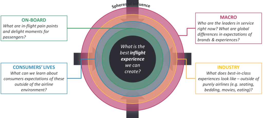
If research wants to have more impact with decision makers, we need to be more palatable for them. This means translating the findings into something they can intuitively understand. The problem is it is easiest to present people with the same representations used by the research: graphs and numbers. This is not the way it ought to be. We need to present decision makers with information in the format most appropriate to their needs and to the decisions they need to make. What is wrong with a lot of presentations today is their design, which requires people to behave in research-centred ways, picking apart data and numbers, ways for which many people are not well suited. What we find, then, is that the form of representation makes a dramatic difference in the ease of understanding the research.

Stay ahead

Get regular insights

Keep up to date with the latest insights from our research as well as all our company news in our free monthly newsletter.
There are two tasks for any audience – finding the relevant information and deciding upon the desired action. The design of the research presentation can either help or hinder this process. We believe we must work harder to make sure the design of the presentation does not get in the way; as if designed inappropriately we are at risk of losing the audience and not giving them the opportunity to find the information and make the most appropriate business decisions.

To combat this, we will argue there are three major changes researchers need to undertake:

  1. Get better at PowerPoint Too often the presentation is a data dump of raw findings from the methodology. Little thought goes into how a novice should understand it. Teams need to be taught design theory and trained in how to maximise the potential of PowerPoint. For example, learning about Gestalt psychology will help researchers know how to space, design and layout results.
  2. Go beyond PowerPoint We need to loosen our grip on PowerPoint and embrace other forms of information delivery. A lot of times a deck of slides isn’t the most appropriate format. Why not put together a video debrief of your findings that brings the information to life? Why not create a bookmark with the top 5 takeaways for your stakeholders? Why not mock up an example advert that best reflects what consumers would most respond to?
  3. Hire a designer We believe having an in-house designer is now as essential as having an in-house data analyst. Not only do designers bring a skill set and design experience that they can leverage, they also are unshackled by years of research training and so bring fresh eyes and perspectives to research, making the output they create at once more relatable and accessible for any audience.

We believe that taking on even just one of these changes will greatly enhance the impact and relevance of research to senior decision makers

There’s a great book by Columbia Business School associate professor, William Duggan, called Strategic Intuition. The book posits that intuition is ‘the selective recombination of previous elements into a new whole.’

One of Duggan’s examples of intuitive thinkers is one of Napoleon’s early campaigns. When ordered to re-take the port of Toulon from the British invaders via frontal assault ‘with the sword and bayonet’, Napoleon suggests an alternative strategy; to take the smaller fort of L’Agiuilelette, which overlooks the port of Toulon. Against the received wisdom of his peers and commanders, Napoleon goes ahead with his plan, takes the fort, and in doing so terrifies the British into leaving Toulon and sets his path for Emperor of Europe.

What’s interesting here – and why Duggan raises this example from history – is how Napoleon came to his plan, by bringing together abstract parts of his memory and experience: his reading of the contour maps on the area of Toulon; his knowledge of how best to deploy light cannon and his understanding of past British defeats. The contour maps showed him that the fort of L’Aiguilette occupied high ground over Toulon; from his light cannon experience he knew he could take the cannon up to the fort and deploy them overlooking Toulon and the British fleet; and his understanding of past British defeats at Yorktown and the Siege of Boston taught him that the British would never again risk being cut off from their navy.

None of those thoughts – contour maps; light cannon; British defeats – were taught to Napoleon together. Instead, as Duggan argues, it is the ‘selective recombination of previous elements into a whole.’

Have you ever had an idea flash into your mind? A random thought disconnected from what you’re trying to concentrate on – that’s strategic intuition. And it’s proof that our brains are non-linear. Try as we might, we struggle to focus on a single thought for a long period of time. Rather our brains are adept at working in our subconscious and delivering fresh ideas and insights at a moment’s notice.

You can’t help but think of multiple things at once, or just as likely thinking multiple things about one idea at once. In contrast, however, Word, PowerPoint and Excel, by their very nature, are linear. Word splits information over different pages, PowerPoint chunks information in slides and Excel breaks then across tabs. And all are subject to the limitations of screen size. This linear function is in direct odds to the brain’s non-linear thinking, forcing you to work to their restrictions.

By chunking information into different pages, slides or tabs it also forces the brain to change its functioning.  When all the information is displayed at once, the brain can focus on analysis and connecting information. We can tap into the very strength of our brain – making random, subconscious associations. However, when chunked over different pages, slides and tabs the brain must first remember all the information it has been exposed to before it can then begin to analyse and connect it. This exerts increased cognitive load on the brain and causes a significant break down in your brain’s ability to create those connections.

So, what if we moved away from linear formats and embraced our brain’s capacity for non-linear thinking, for sparks of insight. This is where the power of Post-It notes – or record cards, or just scraps of paper – come in. 

When first planning or thinking of an idea or concept, a good idea is to plot your thoughts on Post-It notes. Each one holding one thought. And filling your table, or wall, or desk with them. The beauty of this is that it embraces our non-linear brain. A random thought or idea can be jotted down and placed to the side, not distracting your attention by needling your mind but also addressed and captured quickly during it’s fleeting appearance. Overall, Post-It planning seems to help in three main ways:

Making connections

Post-It notes and record cards allow for the creation of non-linear narratives. With the use of Post-It notes, or record cards and a box of pins, you can map out an entire concept visually, highlighting interconnecting thoughts and relationships – celebrating the very non-linear thinking our brains champion and computers cannot copy. As an individual activity working with Post-Its allows us to re-arrange ideas as we go. Once we have captured all our thinking on multiple Post-Its we can then begin to rearrange them over and over again, in different orders and ways until we are happy with our outcome.

A free-form structure

By filling a wall with Post-It notes we are avoiding a linear path through the information, rather we are creating a free-form structure. Every time you look at the wall, or return to the room, you can look at the Post-It notes in a different order. And perhaps draw out new meaning or sense from it. It also means you’re not enforcing a structure on others, they too can create their own path through the information – a very effective element when developing ideas and concepts with others.

Fostering collaboration

When working together, cards and post-it notes invite displayed thinking. By committing our thoughts to paper and then arranging them on a wall we can easily invite others to see our thinking; but just as easily others can begin to add to, edit or rationalize our thoughts, so that together we can create a shared cognition about an idea and together create a common understanding. This shared activity fosters creativity, especially as any person can re-arrange cards.

So, before you next fire up your laptop ask yourself, would I be more creative if I used Post-Its and embraced my brain’s non-linear thinking?