
Customer success teams are bombarded with unprecedented data about how their customers interact with products and services. Every minute, vast information streams are generated from multiple sources—social media feeds, business transactions, Internet of Things (IoT) devices, and more. This relentless influx, often called “information overload,” poses a significant challenge: how can we sift through, interpret, and harness this data effectively?
The answer lies not just in the data itself but in its presentation.
More than ever, the art of visualizing data to craft compelling stories is becoming pivotal. It’s about transforming numbers and metrics into narratives that resonate deeply.
For customer-centric brands, the core objective is to forge robust and enduring relationships. Achieving this requires understanding your customers’ needs, challenges, and aspirations. But it’s not just about gathering insights—it’s about communicating them. Effective storytelling and data visualization don’t just convey facts; they connect, persuade, and drive action. These skills empower customer success teams to act as invaluable bridges between customer data and strategic outcomes.
This is where presenting the insights comes into play.
Presentation isn’t just about making data look good; it’s a key factor in how effectively it is understood and used in decision-making. Imagine being in the market research world, where every bit of consumer behavior, every prediction of where the market is heading, and every strategy crafted is crucial. The clarity with which we convey our findings doesn’t just add value—it’s often what separates a groundbreaking insight from a costly oversight.
But here’s the kicker: having mountains of data isn’t enough. What matters is how quickly and accurately stakeholders can digest this information and grasp its implications. This is where the art of presentation shines—through eye-catching charts, detailed graphs, or interactive dashboards. How we present our data becomes just as critical as the data points themselves. It’s not just about showing numbers; it’s about telling a compelling, understandable, and actionable story.
Given this context, effective visual communication and data visualization emerge as critical elements in market research. They are not merely tools for beautification but essential means for unlocking and communicating insights. Well-designed visuals can distill complex data into clear, impactful stories that engage stakeholders and drive strategic decisions.
The Power of Visual Storytelling in Data Presentation and Market Research
Visual storytelling in market research refers to using graphic elements to incorporate data into an engaging and informative narrative, making complex information accessible to all stakeholders regardless of their expertise in data analysis. Researchers can highlight trends, patterns, and anomalies by employing visuals such as charts, infographics, and animations, making it easier for decision-makers to grasp subtle nuances and take informed actions.
So, how do you tell a compelling story?
Here are several dynamic ways a brand can leverage storytelling with customer data:
- Creating Personas: Develop personas with fictional biographies to vividly represent different customer segments.
- User Experience Narratives: Illustrate common challenges through a typical user’s experience, providing a relatable context.
- Customer Case Studies: Explore real-life scenarios where customers successfully navigated obstacles, showcasing the effectiveness of your solutions.
- Narrative Journey Maps: Construct journey maps that outline the customer’s path, complete with narrative arcs and plot points that tell a compelling story.
- Year-in-the-Life Analyses: Craft “year-in-the-life” stories to highlight significant milestones and achievements over an annual cycle.
Once you have visualized your data using sophisticated tools, here are effective techniques to craft engaging narratives:
- Decoding Data Insights: Clearly explain the data’s relevance and significance to your audience, offering essential background to frame insights within a larger context.
- Bringing Data to Life: Use specific customer stories and examples to humanize the data, fostering a personal connection with your audience.
- Narrative Structure in Data: Organize your presentation like a journey with a clear beginning, middle, and end, allowing the audience to follow and absorb key insights easily.
- Enhancing Visuals with Annotations: Utilize annotations, callouts, and highlights on your charts and visuals to spotlight crucial data points and trends.
- Harmonizing Visual Design: Maintain consistent branding with uniform fonts, colors, logos, and design elements throughout your presentations for better retention and a professional appearance.
- Streamlining Information: Focus on clarity by limiting the cognitive load; avoid bombarding the audience with too much text, complex visuals, or information overload.
- Driving Actions with Data: End each presentation with decisive, actionable steps based on the data, providing concrete recommendations for stakeholders to implement.
“Effective data visualization acts as a bridge between complex information and actionable insight. At Kadence International, we empower stakeholders by transforming dense data into clear, actionable visual stories. This enhances decision-making and highlights our commitment to innovation in design.” — Ani V, Head of Design (Americas), Kadence International
Using Visual Storytelling to Transform Complex Data into Understandable Narratives
Visual storytelling in market research can take many forms, each simplifying and enhancing the comprehension of complex datasets. For instance, a time-series graph can illustrate sales trends over multiple years, highlighting seasonal spikes or declines that might be lost in a table of numbers.
Infographics are particularly useful in displaying consumer demographics or survey results, using icons and varied colors to segment data visually and enhance readability.
Another example is heat maps, which can indicate geographic concentrations of market activity or consumer preferences, providing a quick visual interpretation of data that might otherwise require complex statistical analysis.
Consider a traditional market research report on consumer satisfaction that includes pages of tabulated survey responses—scores from 1 to 5 across various service dimensions like timeliness, quality, and customer support. The data, while comprehensive, is dense and cumbersome, requiring stakeholders to scrutinize numerous tables to draw meaningful conclusions.
Now, reimagine that same data presented through an interactive dashboard.
Each service dimension is visualized using star ratings, color codes, and sliders to depict satisfaction levels. Interactive elements allow users to filter results by demographic criteria like age, gender, and location, providing instant visual segmentation. Comparative bar graphs summarize the overall performance against competitors, highlighting strengths and areas for improvement.
This transformation through visual storytelling not only makes the data more digestible but also more engaging. Stakeholders can instantly identify key areas of concern and strength, facilitating quicker and more targeted decision-making.
Here’s an example of a dashboard showing consumer sentiment analysis gathered from social media and survey data, with sales forecasts.
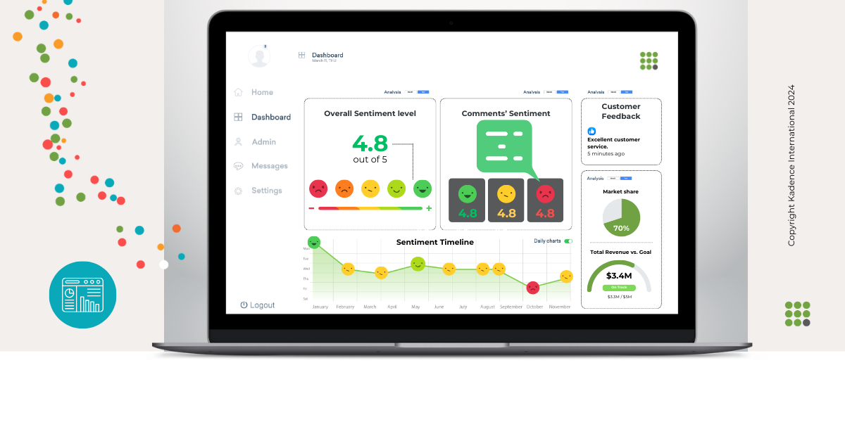
Let’s say a brand is launching a new product. The marketing team could present a dashboard integrating consumer sentiment analysis from social media and survey data with sales forecasts. This visual presentation could use sentiment gauges and trend lines that make it easy for the non-technical executive teams to understand consumer enthusiasm and its potential impact on sales. The clear visualization of positive sentiment aligned with strategic launch locations will help secure executive buy-in for the proposed marketing plan, leading to a successful product rollout.
Key Design Principles: Simplicity, Clarity, and Engagement
Effective data visualization is founded on three fundamental principles: simplicity, clarity, and engagement.
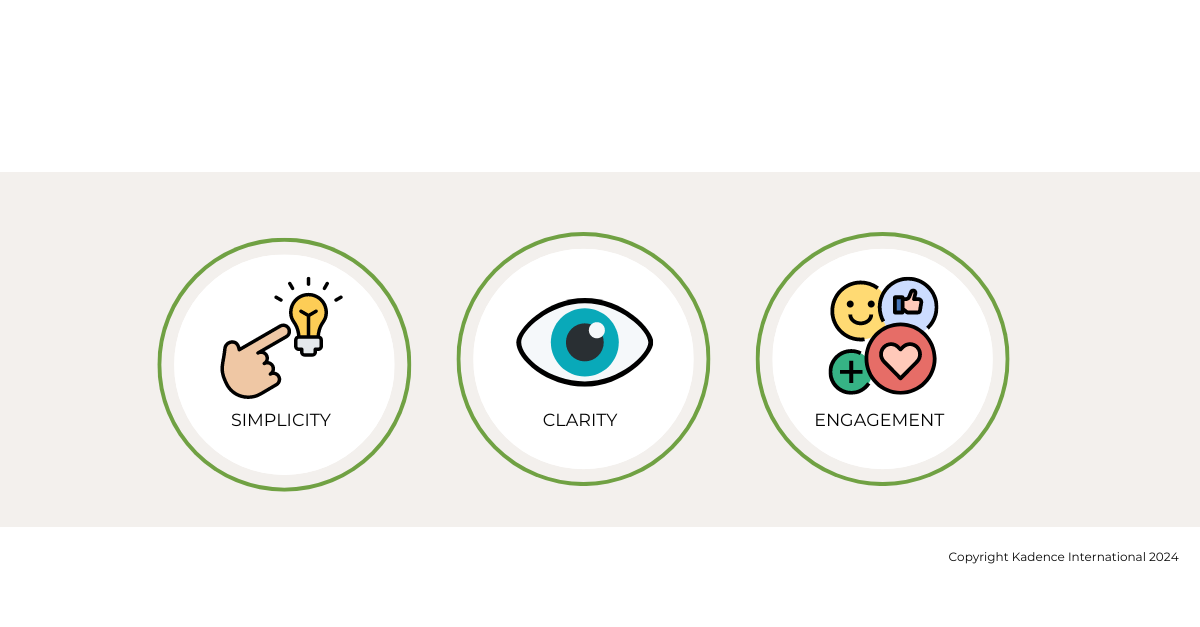
Simplicity involves stripping down the visualization to its essential elements, avoiding over-complication that can distract or confuse the viewer.
Clarity ensures that every visual element communicates information in a straightforward manner, making it easily understandable at a glance.
Engagement pertains to crafting visuals that capture and hold the audience’s attention, encouraging them to explore the data further.
“While the presenter’s perspective will likely shape any presentation of data, it’s crucial to abide by basic common sense design principles to ensure an honest representation of data.” -Hassen Morad, Senior Data Visualization Analyst – Americas at Kadence
In market research, applying these principles can dramatically enhance the utility and impact of presented data:
- Simplicity in market research visualization means presenting data without unnecessary complexity, focusing on key insights. This is crucial when dealing with diverse stakeholder groups, ensuring everyone can understand the findings regardless of their analytical background.
- Clarity is achieved by organizing data logically and appropriately using visual elements like scales and legends. Clear visualizations help stakeholders quickly grasp what the data says and the implications for the brand.
- Engagement is fostered by designing visually appealing studies that narrate a story, making the exploration of data not just insightful but also enjoyable. Engaging visuals can lead to deeper interactions with the data, prompting stakeholders to ask questions and seek further analysis.

Visual Examples: Color Coding, Layout Strategies, and the Use of Icons and Graphs
When designed according to simplicity, clarity, and engagement, the following visual elements transform raw data into compelling visual stories that facilitate better understanding, prompt insightful questions, and drive informed decision-making in market research.
Effective data visualization in market research can be illustrated through specific visual techniques:
- Color Coding: Utilizing different colors can dramatically enhance the readability and effectiveness of data presentation. For instance, using a consistent color scheme to represent different product categories across various visuals (charts, graphs) helps maintain continuity and eases understanding. Colors can also highlight anomalies or important data points, directing viewers’ attention to key insights.
- Layout Strategies: The arrangement of visual elements is critical in how information is perceived. For example, the strategic placement of charts and key insights in a dashboard can guide the viewer’s eye in a logical flow from general overviews to detailed analyses. This systematic arrangement ensures stakeholders can follow the narrative woven through the data.
- Use of Icons and Graphs: Icons are an effective way to communicate concepts quickly. For example, using a shopping cart icon to represent sales data immediately informs the viewer of the context. Graphs such as bar charts for comparison, line graphs for trends over time, and pie charts for market share distributions are indispensable tools in market research. They transform numbers into visually intuitive information, making complex data accessible at a glance.
Techniques and Tools for Data Visualization
Several tools and software stand out in market research for their robust data visualization capabilities, making them indispensable for analysts and researchers.
Tableau is highly regarded for its ability to create complex and visually appealing data visualizations easily. It offers extensive customization options and powerful analytics, ideal for deep insights into consumer data and market trends.
Microsoft Power BI is another leading tool known for its integration with other Microsoft products and services, which facilitates a seamless flow of data within organizations.
Advanced Techniques Like Interactive Dashboards and Real-Time Data Feeds
Interactive dashboards are a leap forward in how data interacts within market research. These dashboards allow users to drill down into specifics by interacting with the data, such as filtering by demographic factors, periods, or other relevant segmentations. This interactivity ensures stakeholders can manipulate their views to answer specific questions or explore hypotheses about market behavior.
Real-time data feeds are another advanced technique where live data is streamed directly into dashboards, providing the latest information at a glance. This is especially valuable in dynamic markets where conditions change rapidly, and up-to-the-minute data can influence key business decisions.
Incorporating Multimedia Elements Such as Videos and Interactive Maps
Multimedia elements can significantly enhance the effectiveness of data visualizations by providing more engaging ways to present and interact with information. Videos, for instance, can narrate the story behind the data, offering a dynamic and engaging way to present findings or explain complex processes.
Interactive maps are particularly useful in market research for geospatial analysis, where data related to consumer behavior, sales distribution, or market penetration needs to be contextualized geographically. These maps allow stakeholders to visually explore variations across different regions, facilitating a better understanding of market dynamics on a global or local scale.
Together, these tools and techniques create a comprehensive toolkit for market researchers, enabling them to transform raw data into actionable insights through sophisticated, engaging, and highly informative visualizations. This not only aids in better understanding and decision-making but also ensures that insights are communicated effectively to all stakeholders involved.
Enhancing Stakeholder Engagement through Visualization
Visual data is critical in bridging the gap between complex market research findings and various stakeholder groups, including executives, product managers, marketing teams, and investors. Each group has distinct informational needs and decision-making responsibilities that visualizations can cater to by customizing the data’s presentation. For instance, executives might need high-level dashboards focusing on ROI and market growth, while product managers may require detailed user engagement statistics. Effective visuals grab attention, enhance comprehension, and make the data not only accessible but also actionable across these diverse groups.
Strategies for Presenting Data to Non-Technical Audiences
Presenting data to non-technical audiences involves a few key strategies to ensure clarity and engagement:
- Simplify the Information: Use clear, straightforward visuals like pie charts for percentage distributions or bar graphs for comparisons. Avoid clutter and focus on one main idea per visual.
- Tell a Story with Data: Organize the presentation to follow a narrative arc that leads the audience through the data in a logical, engaging manner. Begin with setting the context, presenting the core data, and concluding with actionable insights.
- Use Annotations and Guided Walkthroughs: Annotations can help explain unfamiliar terms or highlight key points. Guided walkthroughs during live presentations can further aid understanding by addressing parts of the data as they relate to the stakeholders’ interests.
- Interactive Elements: Allow stakeholders to interact with the data through tools like sliders or filters. This interaction interests them and lets them explore the data at their own pace and according to their personal or departmental focus.
Examples of Effective Stakeholder Presentations and the Results
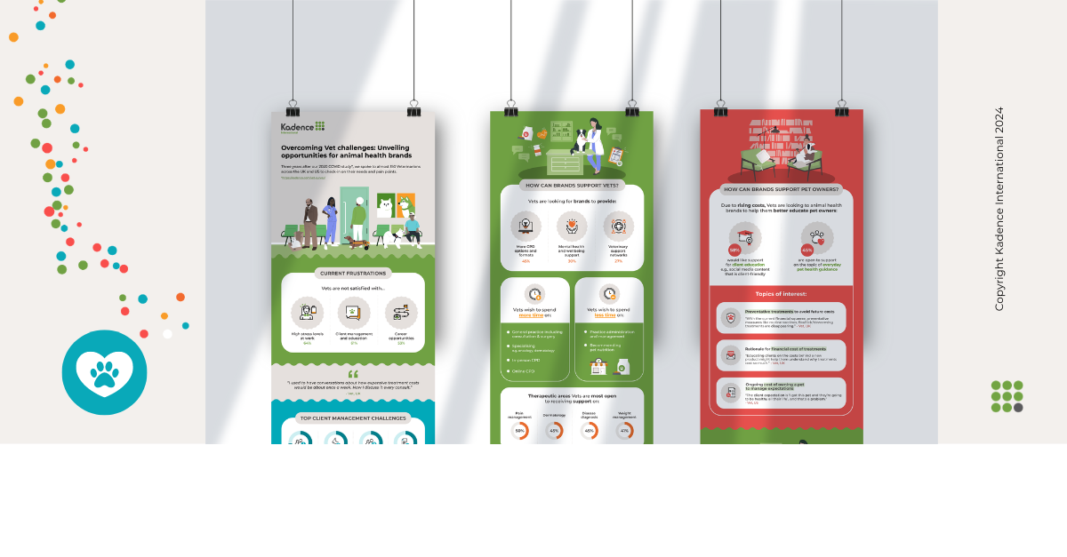
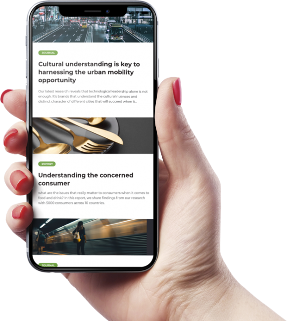
Here’s an example of our study unveiling opportunities for animal health brands.
We recently conducted a research project in the UK, investigating how brands can assist Vets in the current economic climate by comprehending their difficulties and connection with pet owners. Our team created an infographic with the findings, which you can check out here.
Customer-Centric Visualization Strategies
In market research, placing the customer at the heart of data stories is essential for creating products and services that truly resonate with target audiences.
Customer-centric visualizations focus on translating customer behaviors, preferences, and feedback into visual formats that all business areas can easily understand and act upon. This approach ensures that the customer’s voice is heard and valued and aligns business strategies with customer needs, enhancing customer satisfaction and loyalty and driving business growth.
Techniques for Visualizing Customer Data to Reveal Behaviors and Preferences
Effective techniques for visualizing customer data include:
- Segmentation Heatmaps: Use heatmaps to show how customer segments interact with various product or service aspects. For example, color intensities can indicate the frequency of use or preference levels across different demographics.
- Customer Journey Maps: Illustrate the customer’s journey from awareness to purchase and beyond with detailed visual maps highlighting pain points, satisfaction peaks, and areas for improvement.
- Preference Clusters: Utilize cluster analysis visuals to group customers by shared preferences or behaviors, depicted through scatter plots or bubble charts, helping brands tailor marketing and product development strategies.
- Sentiment Analysis: Graph customer sentiment from reviews and social media on a sentiment scale. This can be visualized through word clouds for qualitative data or plotted over time to detect changes in customer sentiment.
Measuring the Impact of Good Data Visualization
Criteria for Evaluating the Effectiveness of a Data Visualization
The effectiveness of data visualization can be assessed through several key criteria:
- Accuracy: The visualization must accurately represent the underlying data without distorting the truth. This is fundamental to maintaining the integrity of decisions based on the visual.
- Clarity: It should be easy for the viewer to understand the visualization without extensive explanations. Clear visuals avoid excessive complexity and focus on conveying the main message succinctly.
- Utility: The visualization should fulfill its intended purpose, whether it’s to reveal trends, compare data, or highlight specific metrics. Its utility is measured by its ability to drive insights and actions effectively.
- Aesthetics: While function is more critical than form, a well-designed, aesthetically pleasing visualization can enhance engagement and comprehension.
- Accessibility: Good data visualizations are accessible to all users, including those with disabilities. This includes considerations for color blindness and providing textual alternatives or descriptions where necessary.
Metrics and Feedback Mechanisms to Assess Visualization Impact on Decision-Making
To measure the impact of data visualization on decision-making, several metrics and feedback mechanisms can be employed:
- User Engagement Metrics: Track how users interact with visualizations, including time spent, interaction points, and frequency of access. High engagement often indicates that the visualization is effective and useful.
- Decision Impact Surveys: After decision-making meetings or presentations, survey stakeholders to gather feedback on how the visualizations influenced their understanding and decisions.
- A/B Testing: In situations where decision pathways can vary, employ A/B testing to compare the outcomes of decisions made with different visualizations.
- Conversion Rates: In marketing or sales contexts, measure how changes in visualization strategies affect conversion rates, signifying a direct impact on business outcomes.
Testimonials and Expert Opinions on Successful Visualizations
Testimonials and expert opinions can provide qualitative insights into the effectiveness of data visualizations:
- Expert Reviews: Have data visualization experts review and provide feedback on the visuals, offering insights into their effectiveness and adherence to best practices.
- Client Testimonials: Gather testimonials from clients or internal stakeholders who have used the visualizations in their decision-making processes. Positive feedback can validate the effectiveness of the visual designs.
- Case Studies: Publish case studies that detail the use of specific visualizations and their impact on business decisions and outcomes. This not only serves as evidence of success but also provides a blueprint for similar applications in the future.
Challenges and Considerations in Designing Data Visualizations
Effective data visualization is as much an art as it is a science, but certain common pitfalls can undermine its success:
- Overcomplication: Adding too many elements or too much data can overwhelm the viewer, making it difficult to discern the key messages. Simplification is often more effective, focusing on what is most important.
- Misleading Graphics: Inaccurate scales, inappropriate graph types, or cherry-picked data can mislead viewers, either intentionally or unintentionally. For instance, using a truncated y-axis can exaggerate minor differences in data, misleading viewers about the significance of the results.
- Ignoring Context: Visualizations that fail to consider the audience’s knowledge or expectations can be confusing or misinterpreted. Tailoring the visualization to fit the context and the audience’s needs is crucial for effective communication.
- Style Over Substance: Prioritizing aesthetic appeal over clarity and functionality can distract from the data’s core insights, potentially leading to misinterpretations or overlooked details.
Ethical Considerations in How Data is Presented
The ethical presentation of data is paramount in maintaining trust and integrity in market research:
- Transparency: Always clearly explain how data was collected, analyzed, and visualized. Any limitations or biases in the data should be openly discussed.
- Accuracy: Ensure all visual representations are true to the data. This includes selecting the appropriate type of graph or chart that accurately reflects the relationships and proportions in the data.
- Privacy: Be mindful of privacy concerns, especially when handling sensitive or personal data. Visualizations should never reveal individual identities unless explicitly authorized.
- Fair Representation: Avoid visualizations construed as discriminatory or biased against certain groups. Ensure that data visualizations are inclusive and represent diverse groups fairly.

Future Trends in Data Visualization and Anticipated Challenges
As market research continues to evolve, several trends and challenges in data visualization are anticipated:
- Increased Use of AI and Machine Learning: These technologies will drive the development of more sophisticated data analysis and visualization tools, offering predictive insights and automated pattern recognition.
- Interactive and Real-Time Data: The demand for interactive and real-time data visualizations will increase as businesses seek more dynamic ways to interact with data and make faster decisions.
- Integration with Virtual and Augmented Reality: VR and AR could revolutionize data visualization by providing immersive environments to explore data in three-dimensional spaces, offering new perspectives and deeper insights.
- Data Literacy: As data becomes more central to business operations, improving data literacy across all levels of an organization will be crucial. Visualizations will play a key role in educating and informing stakeholders, necessitating designs that are both informative and easy to understand.
Final Thoughts
Visual storytelling through data visualization has proven to be a transformative power in market research. Visualizations clarify and amplify the underlying stories data can tell by turning complex datasets into comprehensible, engaging narratives. These visual narratives help stakeholders across different levels understand intricate details about consumer behavior, market trends, and operational efficiencies, fostering informed decision-making.
However, the effectiveness of these visualizations depends largely on the skill with which they are crafted. Therefore, market researchers must prioritize their development in design and visualization techniques. Enhancing these skills will improve the quality of data presentation and expand the researcher’s ability to interpret and communicate insights effectively.
Looking ahead, technology integration in data visualization is set to deepen. With advancements in AI, machine learning, and real-time data processing, the future of visual storytelling will likely feature even more dynamic and interactive elements.
These technologies will enable researchers to create more nuanced and powerful visualizations to predict trends and model potential outcomes, making data a lens to the present and a gateway to the future.
The enduring impact of well-crafted visual data presentations will remain a cornerstone of effective market research. By embracing these tools and technologies, market researchers can ensure they keep pace with the digital age and lead the charge in transforming data into action.