Strategic decision-making based on data is key to achieving competitive advantage in global business. Yet, the journey from raw data to actionable insight is often fraught with challenges, especially when ensuring these insights resonate with and engage key organisational stakeholders.
Drawing from my experience working with brands across various industries, I’ve observed a common hurdle: the traditional methods of data presentation, while informative, frequently need to captivate or inspire the intended audience. This understanding has propelled us at Kadence International to pioneer an innovative approach, blending our deep market research expertise with the transformative power of visual design to bridge this crucial gap.
The Art and Science of Visual Storytelling: Crafting Engaging Narratives from Data
The norm in many organisations relies heavily on text-heavy PowerPoint slides to communicate research findings and insights. While this method serves its purpose, it often needs more dynamism to engage and motivate internal stakeholders.
In my journey of collaborating with diverse teams, the power of visual communication to elevate data into compelling, memorable narratives has become unmistakably clear. By stepping beyond the traditional confines of presentation software and embracing a more creative, multidisciplinary approach, we’ve crafted stories that inform and emotionally resonate, ensuring that vital insights are not merely shared but felt and remembered.
Visual storytelling transcends the mere presentation of data; it involves threading insights into a narrative that captures the essence of the information and its implications. This narrative approach is grounded in the understanding that humans are inherently drawn to stories. We find stories more engaging, memorable, and persuasive than abstract data. The challenge and opportunity for market researchers and strategists lie in harnessing this natural inclination toward stories to make complex data accessible and compelling.
The process begins with identifying the core message or insight that needs to be communicated. This is not merely about summarizing data points but about distilling the core of the research into a central theme that can form the backbone of the narrative. From there, it’s about building a story that guides the audience through the data, highlighting key findings and drawing connections to the broader business context. This structure makes the information more digestible and more impactful, as it situates the data within a relevant and meaningful framework to the audience.
CASE STUDY 1
Client: Bloomberg
Background: An infographic for social media use containing key findings and data from a research study conducted by Kadence Singapore. The study explored how business priorities were evolving and adapting to new ways of working during the COVID-19 pandemic.
Insights for Bloomberg
The core objectives of this study were:
- To explore the shift in business decision-makers’ attitudes and behaviours
- To understand how business priorities evolved during the pandemic
- To examine what types of news content decision-makers consumed to help devise their business plans
- To assess which markets in APAC were perceived to be handling the pandemic well or were equipped to restart the economy
CASE STUDY 2
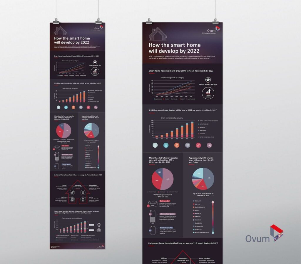
Client: Ovum
Background: How the Smart Home will develop by 2022 – an infographic produced for Ovum as part of a series of thought leadership pieces.
Insights for: Ovum (now OMDIA)

Integrating Design Thinking into Data Presentation
Design thinking plays a crucial role in visual storytelling, particularly in the context of data presentation. This approach emphasises empathy with the audience, creativity in problem-solving, and an iterative process of testing and refining ideas. By adopting a design thinking mindset, researchers and strategists can explore innovative ways to present data, moving beyond traditional charts and graphs to more dynamic and interactive formats.
One effective strategy is to employ visual metaphors and analogies that make abstract data more concrete and relatable. For example, if the goal is to communicate the growth trajectory of a product, one might use the metaphor of a journey, with different milestones representing key achievements or challenges along the way. This makes the data more visually engaging and embeds it within a narrative context that enhances understanding and retention.
Another aspect of design thinking is the emphasis on user experience. Data presentation means considering how the audience will interact with the information. This could involve interactive digital reports that allow users to explore different facets of the data at their own pace or immersive presentations that use augmented reality to bring data and products to life in new and engaging ways.
The Role of Emotion in Data Communication
While the importance of clarity and accuracy in data communication is undeniable, the role of emotion should not be underestimated. Emotional engagement is a powerful driver of attention, retention, and motivation. By tapping into the emotional dimension of data, visual storytellers can create a more profound connection with their audience that goes beyond intellectual understanding to inspire empathy, curiosity, and action.
This emotional engagement can be achieved through various means, such as using colour, imagery, and narrative elements that evoke specific feelings or reactions. For instance, a presentation on customer satisfaction could use visual themes and stories that reflect the customer’s experience, highlighting not just the numbers but the human stories behind them. This approach makes the data more relatable and persuasive, as it connects the insights to the emotional drivers of decision-making.
Tailored Impact: Understanding and Meeting Audience Needs
Each organisation, and indeed each department within, has unique needs and communication preferences. When you work with innovation teams, sales departments, and strategic planners, you realise the importance of customizing the format and medium of your deliverables to suit these varied audiences effectively.
From creating immersive digital 3D models that bring new product concepts to life to designing infographics that simplify complex data for easier consumption, the goal has always been to ensure maximum engagement and impact. This tailored approach ensures that insights are presented and aligned with the audience’s specific needs and preferences, facilitating clearer understanding and stronger motivation to act.
CASE STUDY 3
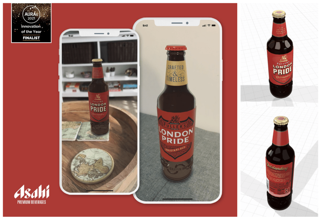
Client: Asahi Europe and International
Background: Asahi partnered with Kadence International on a pilot designed to explore the applications of augmented reality to pack testing. The pilot was focused on one of Asahi’s flagship brands: Fuller’s London Pride.

Kadence visualised the London Pride bottle by creating a three-dimensional model and optimising it for augmented reality. The AR model of the London Pride bottle was then shared with respondents across the UK as an augmented reality experience that could be accessed via a smartphone.
Find out more about the Asahi AR study here.
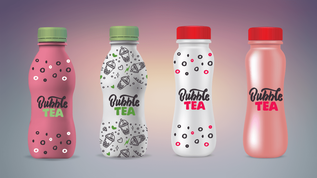
We developed product visuals for various formats and sectors – product visuals can be used for testing and refining concepts.

A Holistic Design Philosophy: Bringing Ideas to Life
The scope of visual communication extends far beyond the screen; it encompasses a wide array of physical and digital mediums. Tangible assets, such as booklets, posters, and even newspaper-style prints, are crucial in keeping strategic insights and plans at the forefront of an organisation’s consciousness.
These physical reminders, strategically placed within a business environment, serve as constant prompts for discussion, reflection, and action, reinforcing the insights’ relevance and urgency.
Embracing Print Design in Data Visualisation
While digital mediums dominate modern communication, print design is invaluable in presenting market research insights. Its tangible nature ensures that key data and strategies are seen and physically interacted with, fostering deeper engagement and retention.
From detailed reports to visually striking infographics, print materials serve as constant reminders of strategic insights, encouraging discussion and action. Incorporating interactive elements like QR codes bridges print to digital, enhancing user experience and allowing for a multifaceted data exploration.
Moreover, personalised print designs can cater to the unique needs of various stakeholders, making insights more relevant and compelling. As sustainability becomes a priority, eco-friendly practices in print production reflect a commitment to environmental responsibility, resonating with stakeholders’ values. In the era of information overload, print design stands out by offering a memorable, engaging way to navigate complex insights, proving its enduring value.

Data from the Front Line: An Exploration into Research in APAC
Produced and printed by Kadence.
Printed booklet covering key data sets across nine markets in APAC, 2018
The Power of Video: Engaging Audiences on a New Level
In a digital age where video content dominates consumer attention, leveraging this medium has become a cornerstone of effective internal communication strategies. Through my work in producing videos for a variety of purposes—from enhancing stakeholder engagement to enriching internal conferences—I’ve witnessed first-hand the profound impact that well-crafted video content can have. It’s not just about presenting data; it’s about storytelling, creating an emotional connection that drives deeper understanding and commitment among viewers.
For a deeper dive into our innovative approaches and to see our insights come to life, visit the Kadence Vimeo channel. Explore our collection of projects, including detailed case studies and our dynamic showreel video, to witness the powerful impact of visual storytelling on market research and strategic decision-making.
Unlock the potential of visual communication with Kadence International, where data meets design to inspire action and drive change.
Watch Now on Kadence Vimeo | View Our Showreel
Collaborative Storytelling: Engaging Stakeholders in the Narrative Process
One of the most critical lessons learned through my collaborations with clients is the value of a partnership approach. Understanding each project’s unique context, goals, and challenges allows designers to create visual content that truly resonates. It’s about marrying our expertise in design and insights with the client’s deep knowledge of their brand and market, resulting in visually captivating, strategically aligned, and impactful outputs.
One of the most effective ways to ensure data narratives resonate with their intended audience is to involve stakeholders in the storytelling process. This collaborative approach allows for a deeper understanding of the audience’s needs, perspectives, and decision-making processes, which can inform the development of the narrative.
Engaging stakeholders early on, from the initial stages of data collection and analysis to the final presentation of insights, fosters a sense of ownership and investment in the narrative. It also provides valuable feedback that can refine the story, ensuring it is aligned with the audience’s interests and business objectives.
This collaborative process can take many forms, from workshops and brainstorming sessions to iterative reviews of the narrative and visual elements. The key is to create a dialogue around the data, inviting diverse perspectives and insights that can enrich the narrative and enhance its impact.
Examples of Bringing Theory to Life
To illustrate the principles outlined above, let’s consider a few hypothetical case studies demonstrating visual storytelling’s power in transforming data into actionable insights.
- Innovating Product Development: A technology company used 3D models and interactive simulations to present research on customer needs and market trends, enabling the innovation team to visualise potential new products and features. This immersive approach made the data more engaging and sparked creativity and collaboration, leading to the development of groundbreaking new offerings.
- Driving Organisational Change: A non-profit organisation embarked on a major strategic shift, using a documentary-style video to share internal and external research insights with its stakeholders. The video combined data visualisations, employee interviews, and stories from the field, creating an emotionally compelling narrative that galvanised support for the change initiative.
- Enhancing Customer Insights: A retail brand developed an interactive digital report to share findings from its customer satisfaction survey, incorporating video testimonials, infographics, and interactive charts. This approach allowed the marketing team to explore the data in depth, uncovering new insights into customer behavior and preferences that informed targeted marketing strategies.
The Future of Data-Driven Storytelling
As we look to the future, the role of visual communication in business insights is poised to grow only more significantly. With the advent of new technologies and the increasing demand for data-driven decision-making, the ability to translate complex data into compelling narratives will become an invaluable skill.
The journey from data to insights to action is complex, fraught with challenges but also ripe with opportunities. By embracing the principles of visual storytelling, design thinking, and collaborative engagement, businesses can unlock the full potential of their data, transforming it into a powerful tool for strategic decision-making and organisational growth.
In an era of information overload, the ability to communicate persuasively is more critical than ever. The future belongs to those who can gather and analyse data and tell the stories that lie within, inspiring action and driving change. As we continue to navigate the vast seas of data, let us remember that there is a story waiting to be told at the heart of every number, trend, and insight.
Drawing from several projects across sectors, one thing remains clear: the transformative power of visual communication in translating data into action cannot be underestimated. Whether through the immersive experience of augmented reality, the apparent visual storytelling of infographics, or the compelling narrative of video content, the ability to convey complex insights in an engaging, memorable manner is critical to driving informed decision-making and strategic action within any organisation.
The journey from data to decision is multifaceted and challenging. Yet, through innovative visual communication strategies, it’s possible to illuminate the path, making insights not just accessible but genuinely impactful.
As we continue to explore and expand the boundaries of what visual design can achieve in the context of business insights, the potential to inspire change, drive action, and shape the future of organisations worldwide is immense.
For those seeking to harness the full power of their insights, embracing the art and science of visual communication is not just an option—it’s a necessity.


 Senior Marketing Executive
 Sales & Marketing
 General Manager PR -Internal Communications & Government Affairs
 Vital Strategies
 Customer Intelligence Director